An analysis of Berserk, specifically how Miura uses paneling in the second Guts-Zodd fight This is not about the way the characters are drawn, but strictly about the ways the panels are placed, their forms, and the techniques used to attract the attention of the reader.
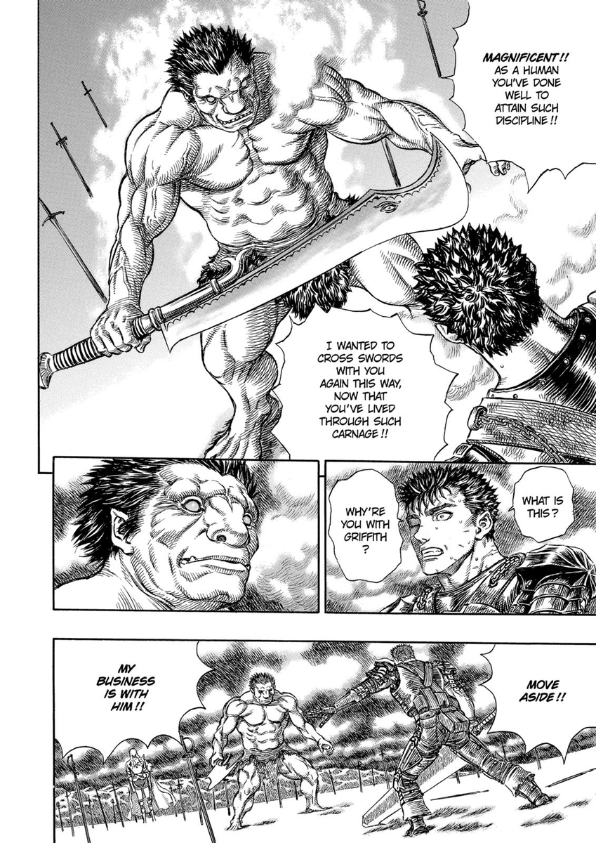
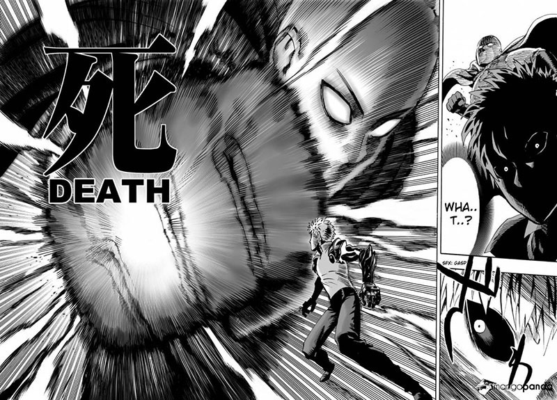
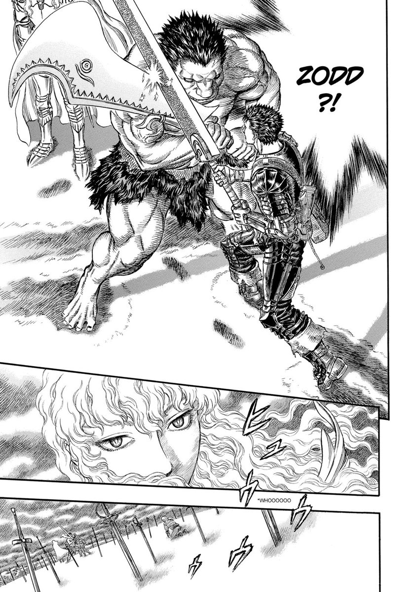
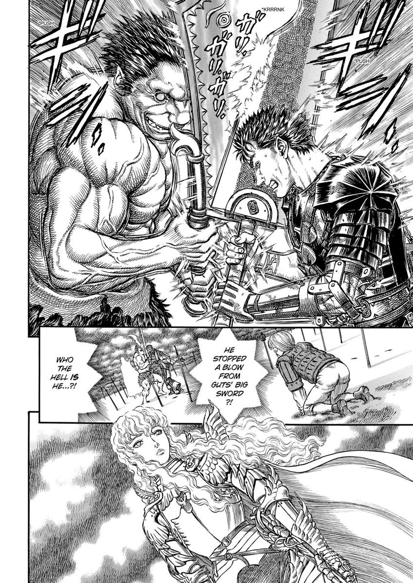
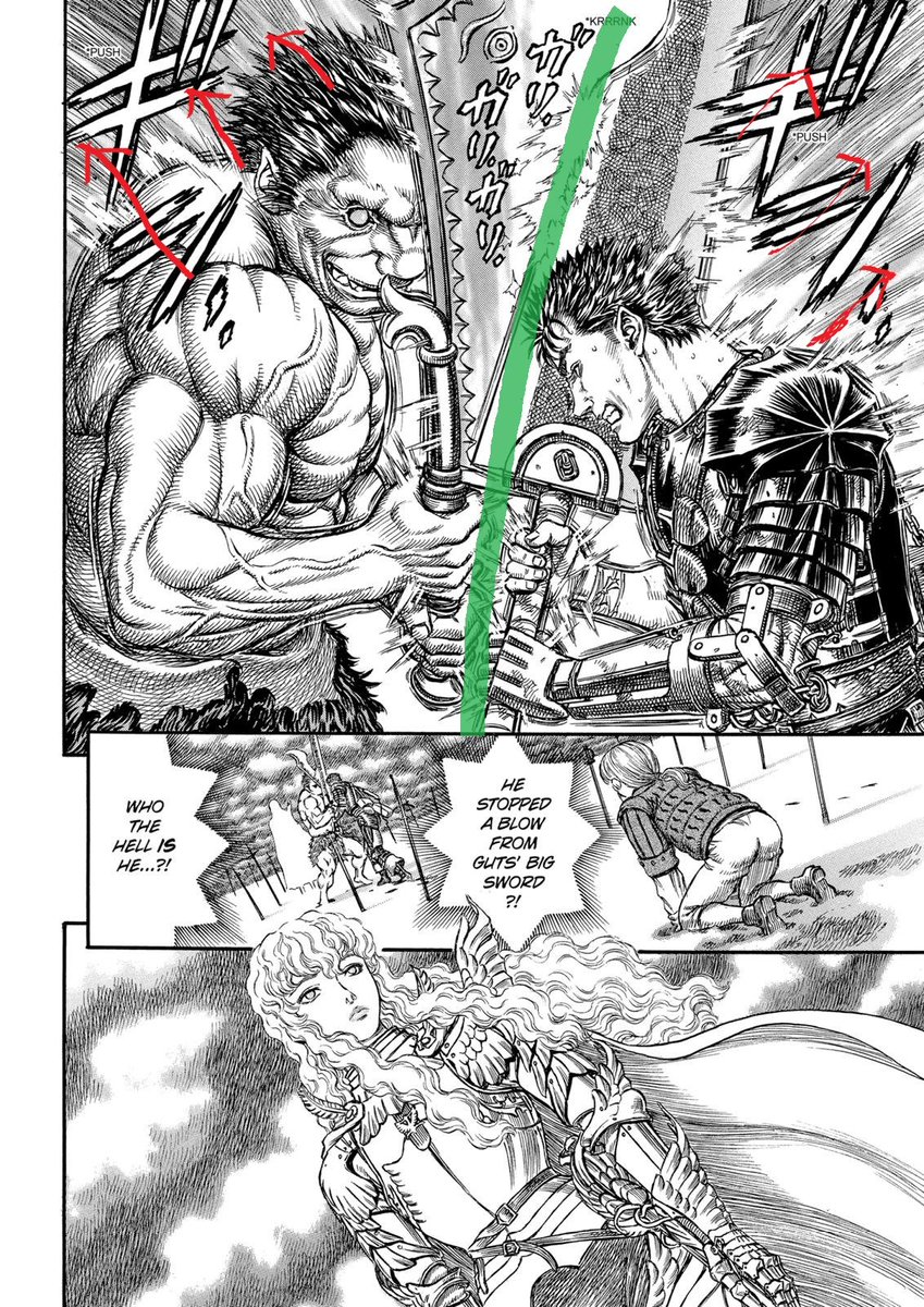
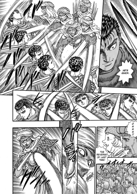
The fight starts on the Hill of Swords when Griffith got the brillant idea of visiting Guts&co to see if he got rid of any feelings for him. Understandably pissed off, Guts tries to slice Griffith in two, only to be stopped by a familiar face : Zodd


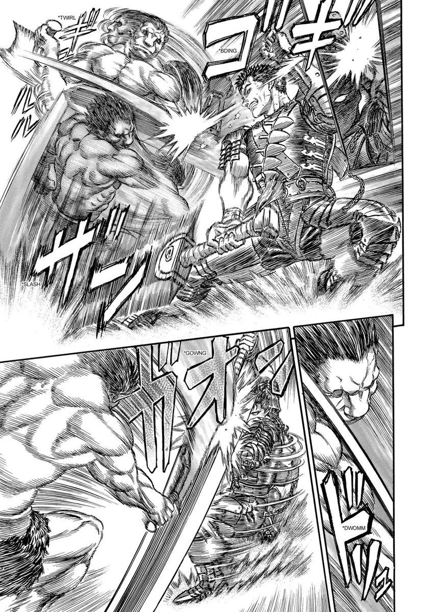
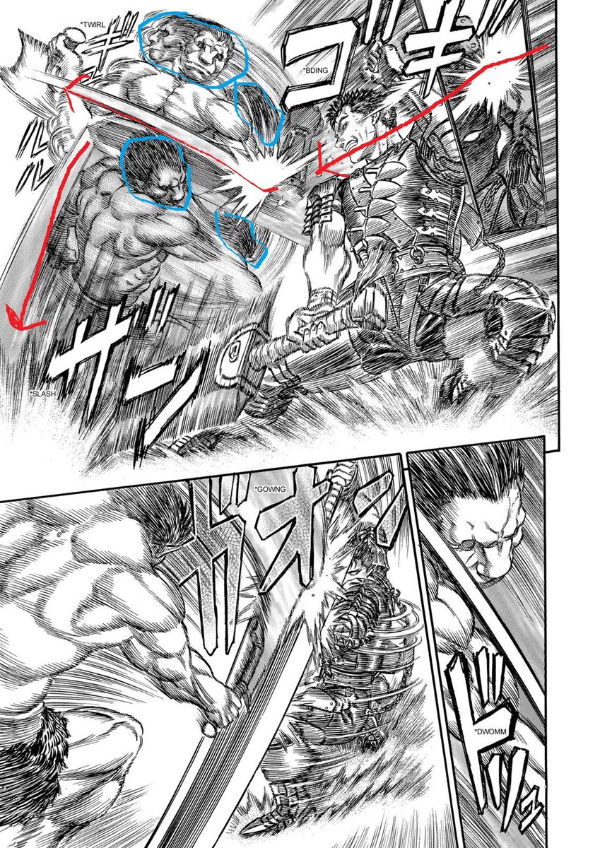
And we already see many of the techniques that Miura will continue to use in this fight. First, Miura doesn't hesitate to change the shape of his panels to enhance the action or to take a specific viewpoint. In this page the first panel is altered to keep Guts foot in view.

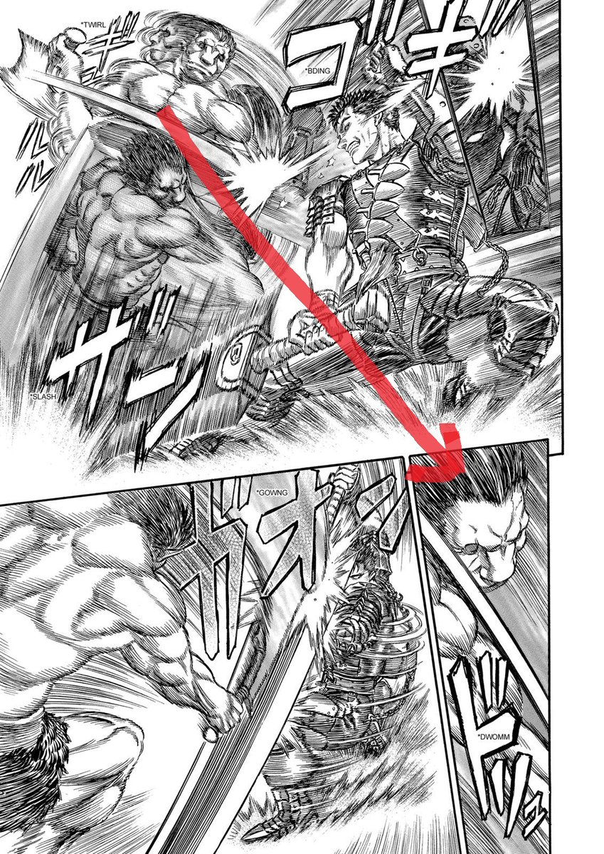
Second, Miura plays with the number of the panels and their borders to build and delivering the climax The small panels give details and the border between them a pause for the reader. Them being inside the big panel with no border renforces the speed and strength of the impact
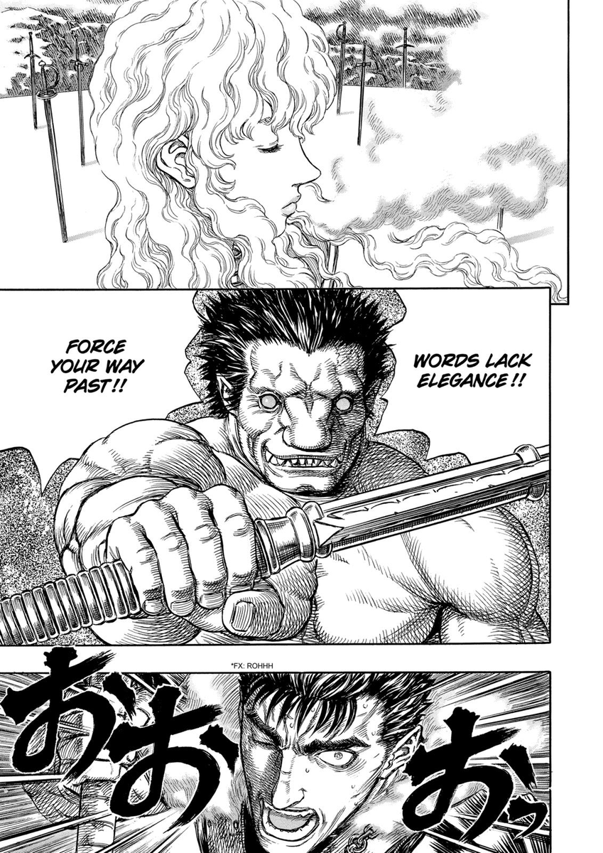
Third, Miura uses perfectly what I think is called "panel flow". The panel flow is usually from right to left in mangas as it is the way you read them. By drawing in the same direction a mangaka compresses the perception of time of the reader and raises the speed of the action.

And you can achieve the opposite effect by going against the panel flow! It dilates time for the reader and makes the action look slower and stronger. It can also be used to better communicate surprise to the reader (surprise attacks for example)


Let's go back to Berserk now. The sword strike comes goes with the panel flow, making it look faster, while Zodd's surprise block is against it. Here Miura uses the panel flow as a spring to better go against it. He also shows Zodd's sword in a small panel first, adding suspens
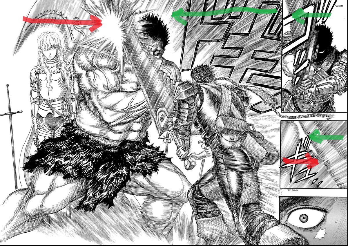
Fourth (and final), Miura sometimes let a sword or bodypart go beyond the border of a panel. In this example the foot of Guts guides the reader's eye so that they go from the feet all the way to the Dragon Slayer and then Zodd + Griffith.

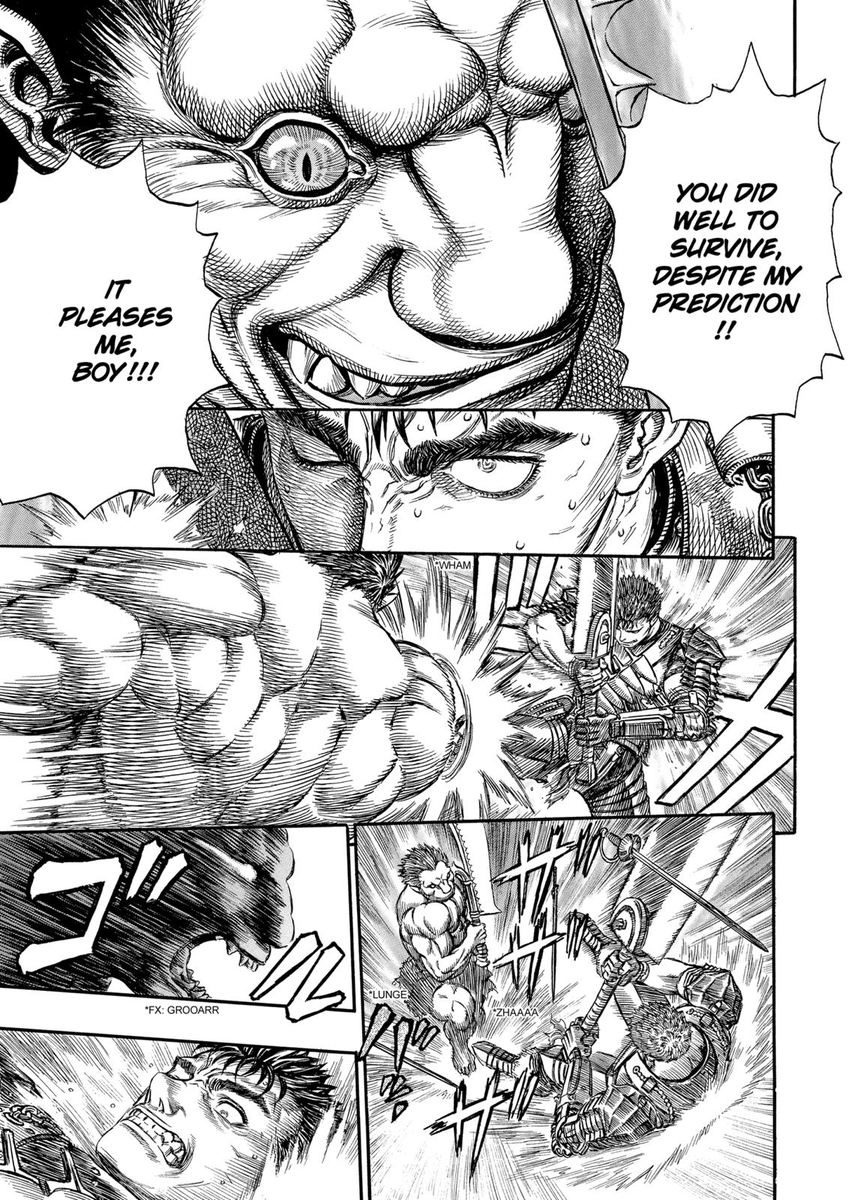
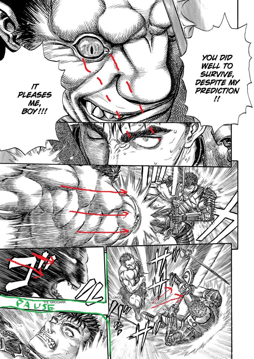
With all those techniques Miura builds suspense for a surprise Zodd appearance who stops Guts fury and triggers reactions from everyone in the following pages. The reactions follow the same pattern : small panels to build the close up on Zodd's face. Then a wider shot.

I will analyse the rest of the fight later, follow me to get the updates haha
Far too late but here we go, it's going to be a loooong ride. We'll see how Miura plays with the our eye movement and the camera to put us in different point of views, and kee. I will explain as if you read the first part so do it or you may not understand everything.
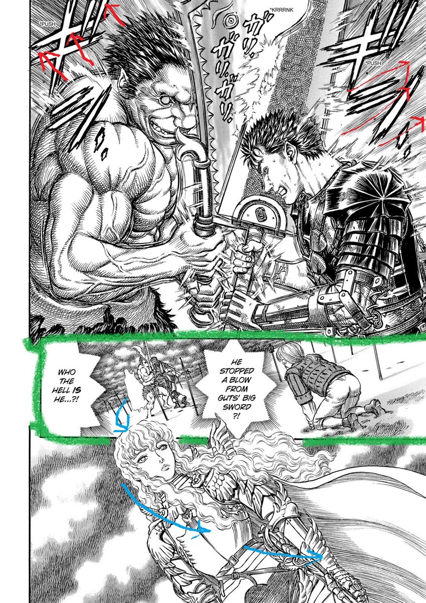
We resume the fight as Guts and Zodd crosses swords in a contest of strength. Zodd thinks this is the ideal time to start a conversation with his favourite fighting prospect before shoving him into the ground to remind him who's the boss.
And we see right at the gate the dynamic of this fight : Guts is the more skilled, technical fighter while Zodd behaves more like a beast with a far superior physicality. In the first panel Zodd is taking more space than Guts, showing the imbalance that will only get worse.
In the second page Zodd is literally towering Guts who seems to suffocate. A cool trick from Miura is to align the gaze of Zodd and Guts, they are looking at each other between the panels. The push is inevitable and goes against the panel flow which gives the attack more strength

When looking at the borders of the panels on the same page you will notice that like with the panel flow, Miura uses them to change the perception of time. But he can also play with the borders for effects, those in green are there for suspens, not to slow down the action.
Before going to the next pages, let's look back at the first one where Miura uses a new technique for the first time : he inversed the panel flow. First he uses thin borders to show things are happening at the same time then the head of Griffith sticks out of the bottom panel.
The eye of the reader goes from the white figure of Griffith to his head and the rest of his person following the blue lines. The reader is reading from left to right. And everything we know about the panel flow is inversed. It's not important here but will come back later.
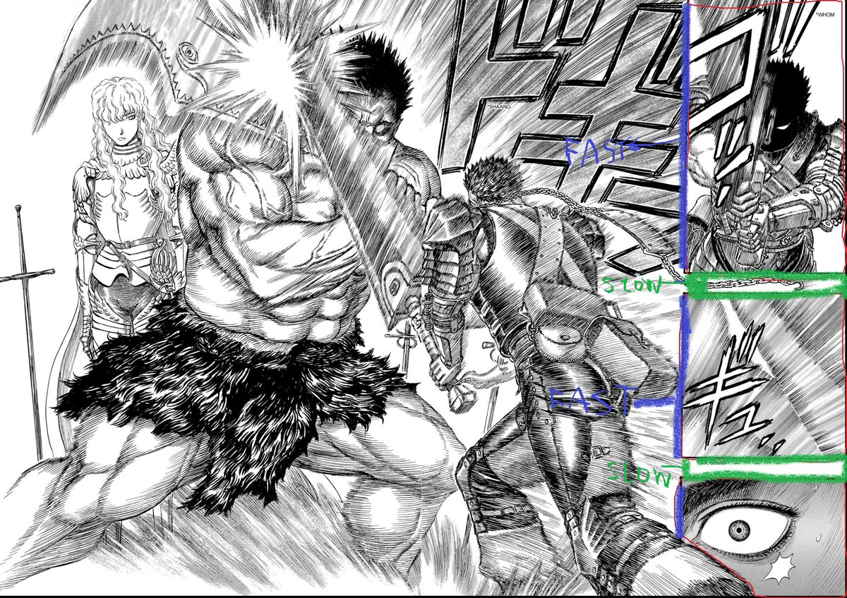
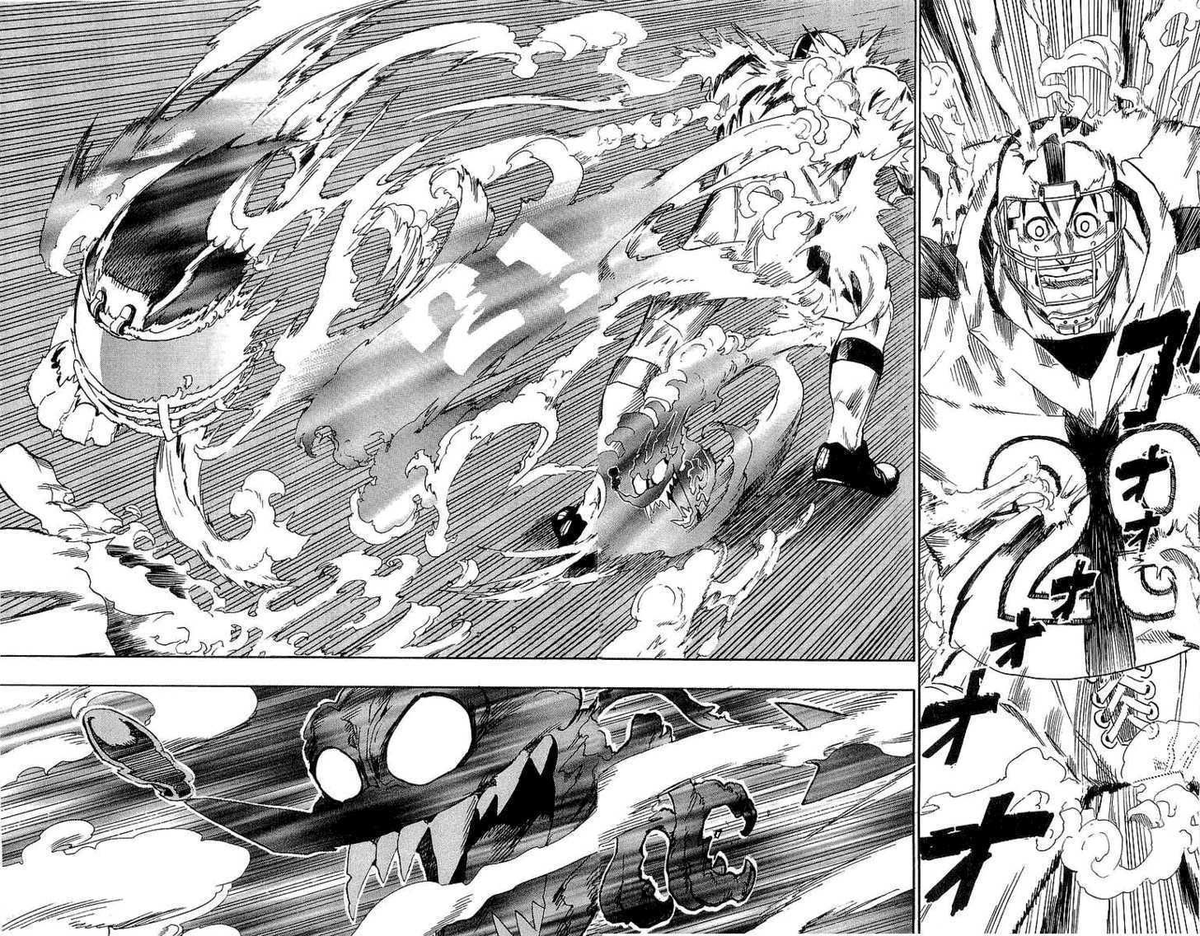
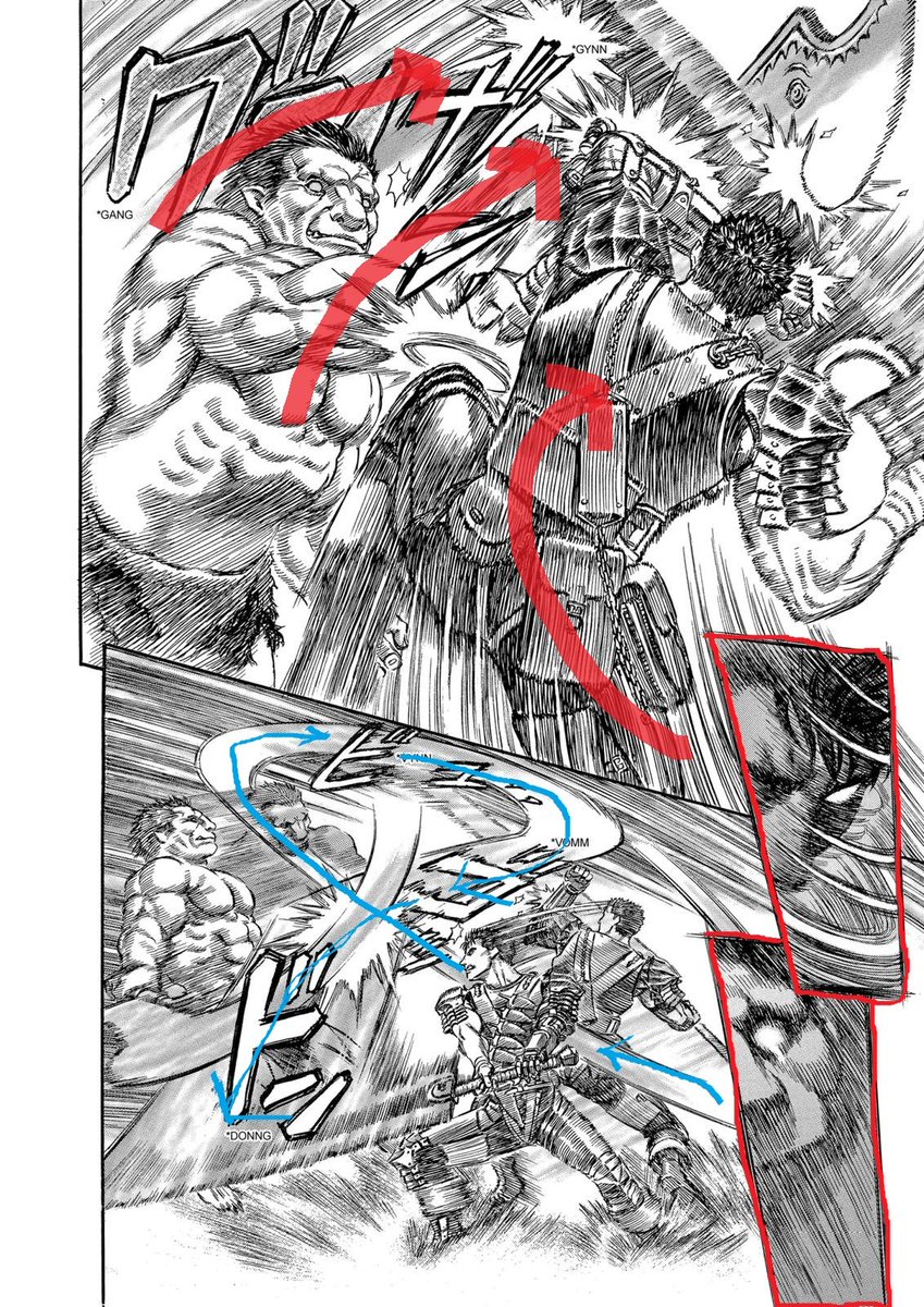
4 pages of fight😳 A lot to unpack here! The easiest thing to point out is that the borders are either very thin or almost not existant. They keep the tension by compressing time, and their effect is evident in the last page where they get bigger to dilate time back to normal.
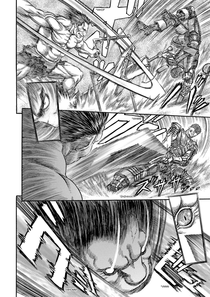

The second thing is the manipulation of the panel flow. In the first image Miura uses what I call "transition panels" (in red) to guide the reader's eye. Those transition panels are small close-up shots and placed literally on two big panels as a bridge.
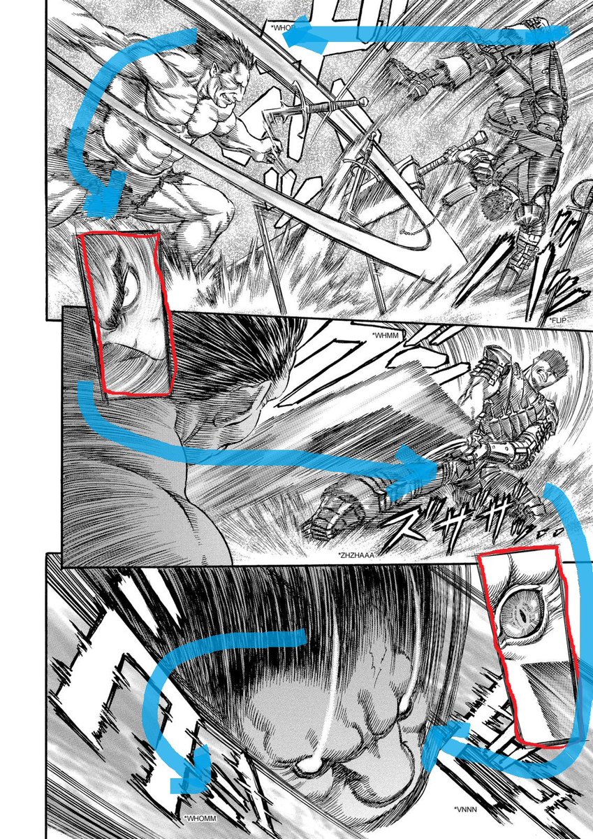
They have two purposes : 1) As we have seen before the number of panels and their size change time perception. Miura can use big panels and keep a fast rythm because the smaller ones add dynamism 2) To change the panel flow, in this case the second panel is read left to right

The first panel is normal, then the first transition panel indicates a counterattack. In the middle panel the camera is behind Zodd's shoulder, we are in his point of view. We share his surprise because with the clever inversion the sword strike is now against the panel flow.

It's a very cool way of putting the reader in Zodd's shoes (or feet) without making him and Guts change side. Miura used it here to also showcase Zodd's inhuman reflexes (surprise attack + reaction from the second transition panel + dodge in the bottom one).
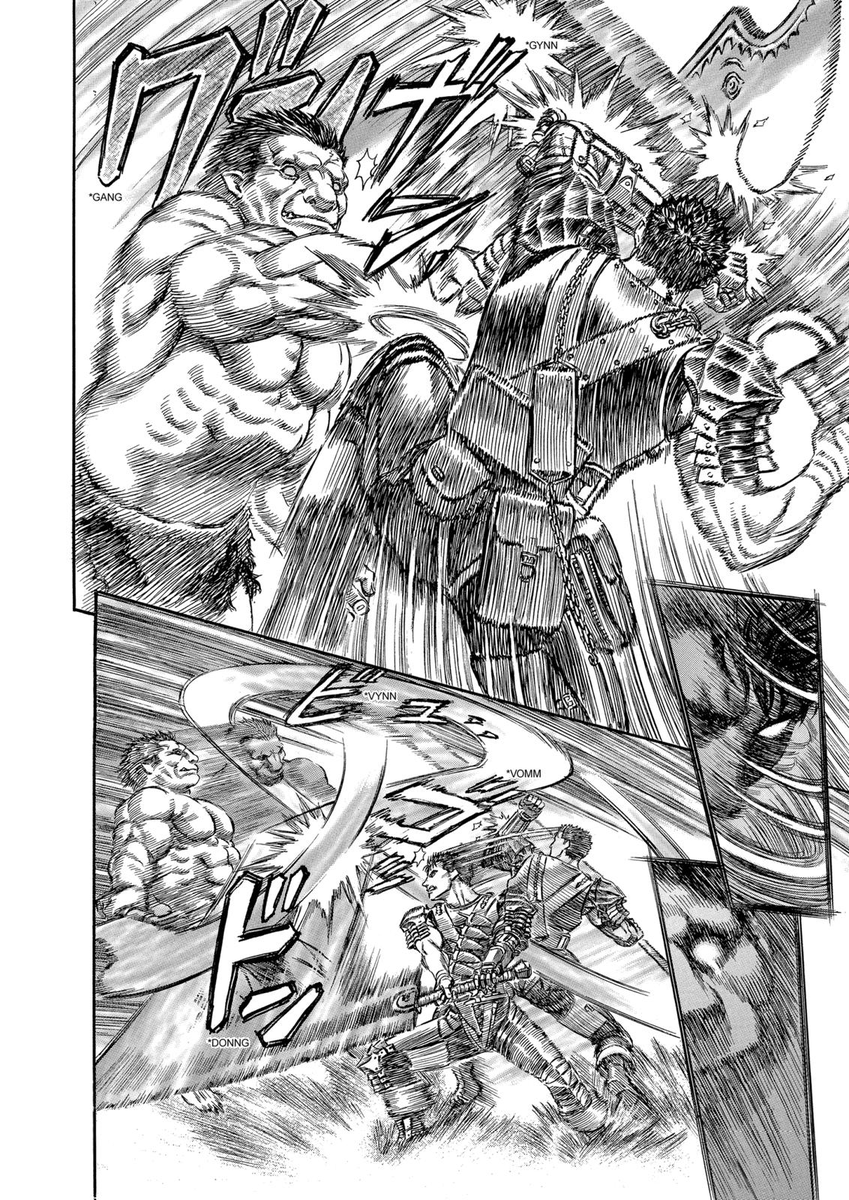
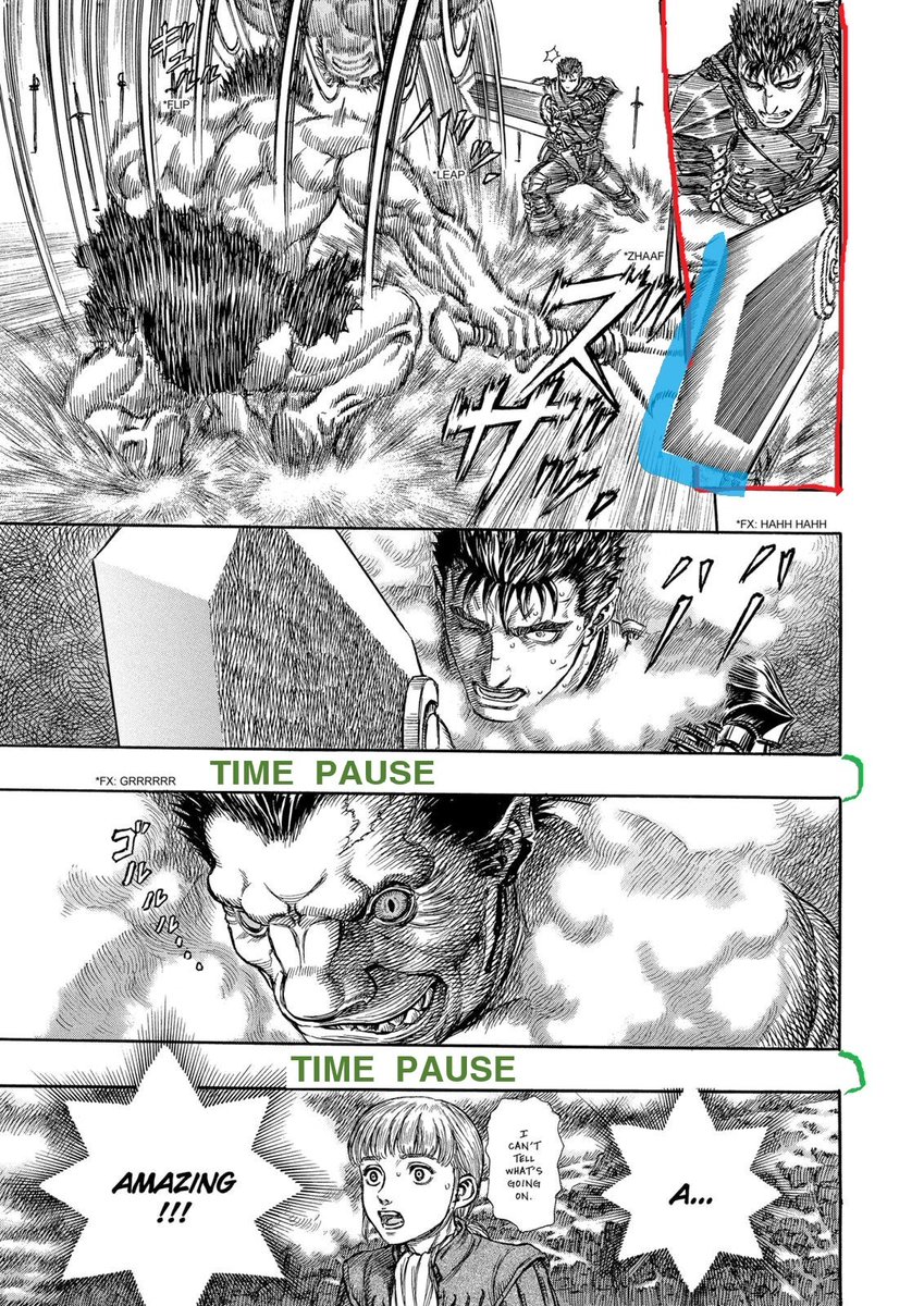
Third point : his original use of afterimages. Afterimages are mainly used three ways in manga. For the classic doppelganger trick; to show a quick counter/dodge or together with the opponent afterimages. In the last case it can describe either an even situation or a dominance.
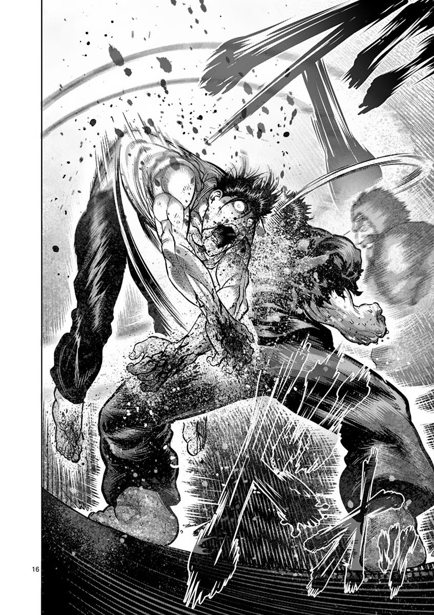
Miura likes their effect but later in Berserk he tried to use them while drawing complex movements with a clear chronology. In short, keep the feeling of seing consecutives movements without it simplifying the dynamic of the fight. He does it in the first panel of the 2nd image.
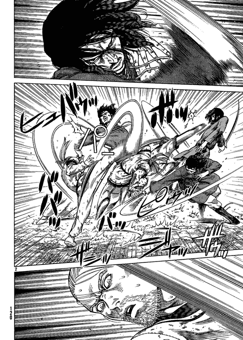
To make the action easy to follow, Miura guides the eye and makes any change clear. We first have a small panel of Guts blocking Zodd's hit from the precedent page, then the action lines + sparks attracts us and we naturally look at the sword.
The following step would be to follow the downward strike of the sword (last red arrow). But by putting Zodd's head in the middle of the sword we want to change our focus and we follow him instead. Drawing his head several times makes his moves very clear to track too.

Did you notice that Zodd strikes in the direction of the next panel? It's a bit like the eye alignment from before, in this case the reader follows the strike in its movement, giving it more speed. We could say that the strike is with the panel flow, but between the panels.
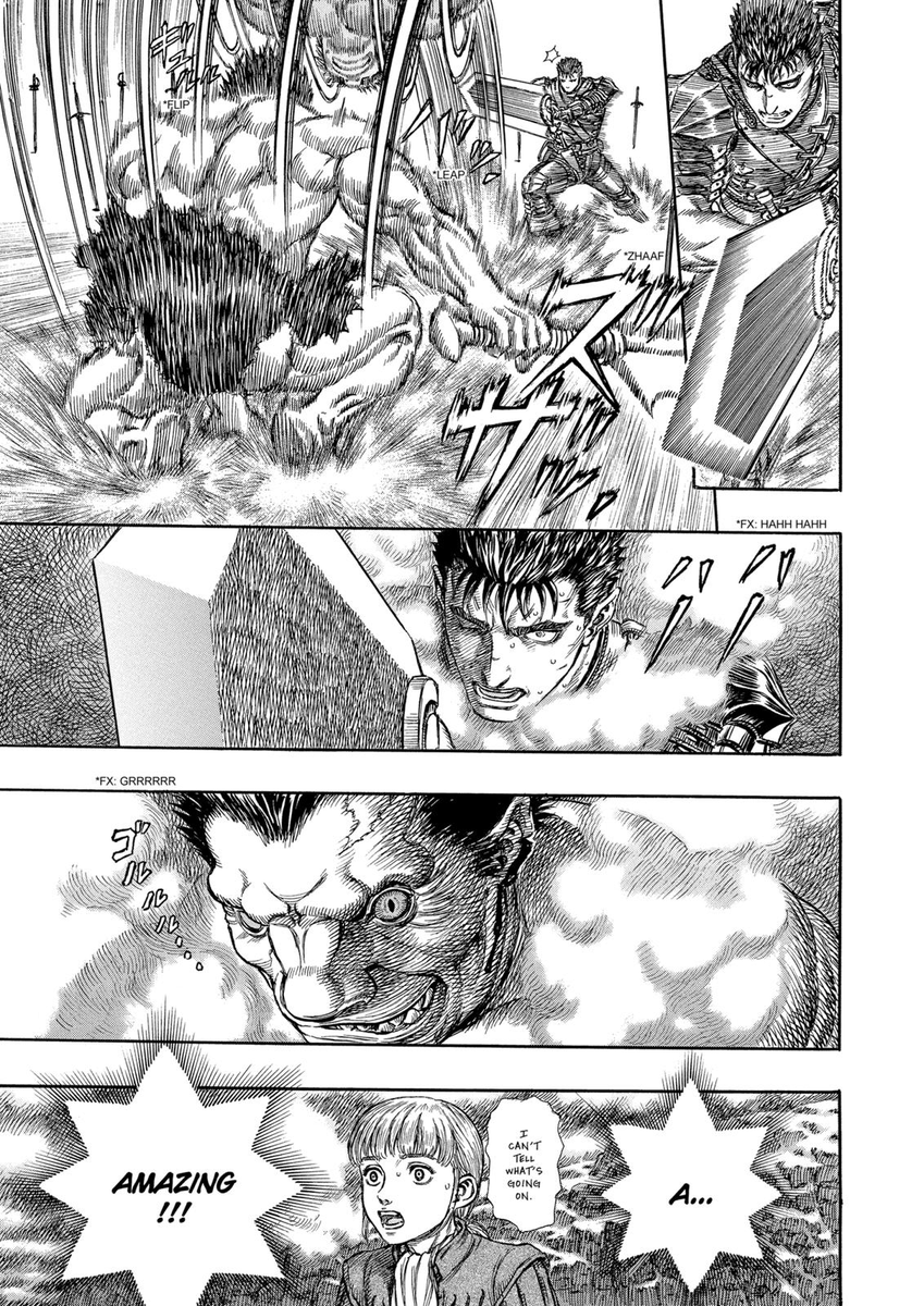
We also have afterimages in the third image. But first we have a twist in the first panel. We go against the panel flow but instead of the right side being surprised and victim of the attack, the roles are reversed. Guts is the one attacking and Zodd the one surprised
Then the transitions panels are working with the afterimages for maximum effect. The first ones prepare us for the counterattack from Guts and Zodd's dodge with two close-ups. Finally the tip of the Dragon Slayer is our lead in the bottom panel. Zodd's really fast btw.

Apart from those three things we have the usual stuff (going with/against the panel flow), and the last page has a good example of a sword going beyond the panel for dramatic effect. Having a vertical panel for it makes the action look quicker compared to the following one.
Next we have a short interlude, like a breather for the readers that lowers the tension. I don't have much to say for those pages, not that there aren't a lot of things to tell, but I want to keep the analysis on the fight itself.