
Thanks everyone for your votes on each of the scenarios. In this thread, I’ll walk through Scenario 1 — both how I thought about it originally, and how decision curves can help. Let’s get started. Popular opinion was to use neither model. My vote was for Model B. Here’s why.
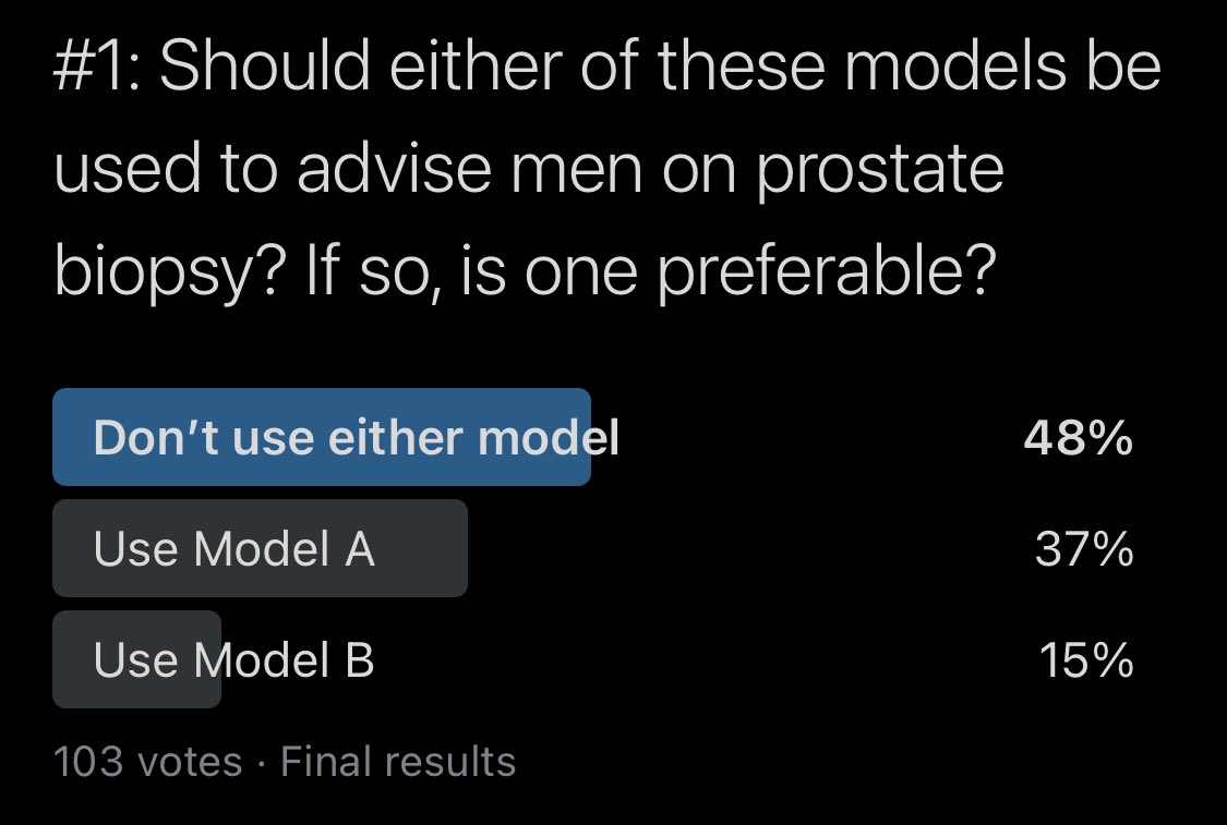
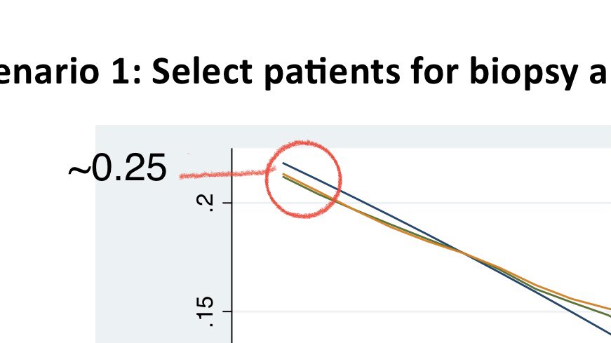
I’ll get to why I voted for Model B but I’ll start in order and share everything I looked at to arrive at that opinion. From the threshold-perf plot (TPP), we can tell that the outcome occurs in ~25% bc the PPV at a threshold of 0 (left), where all preds are positive, is 25%.

Next, I looked at discrimination. By the numbers, Model A has a slightly higher AUC than Model B. I didn’t do any bootstrapping or DeLong 95% CIs here but the numbers aren’t that different qualitatively (0.81 for Model A and 0.79 for Model B).
Next, I looked at TPP. Model A has a wider range of predictions but the density plot of predictions shows Model A’s predictions more tightly distributed at a threshold of ~5%. At thresholds < 25%, Model A has lower sens but higher spec than Model B, which is reversed for > 25%.
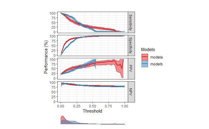
Next, I looked at calibration. Based on the calibration plot with loess, both models underpredict risk. However, Model A’s predicted prob approximates observed risk at high thresholds (>60%), while Model B’s predicted prob approximates observed risk at low thresholds (<20%).
To put this together, I thought about the context in which the model would be used. Since the proposed use of the model is to identify pts with aggressive prostate cancer, a reasonable threshold that would lead urologists to opt for biopsy would likely be <20% risk (assumption).
At thresholds <20% (where it “matters”), Model B was fairly well-calibrated. It doesn’t really matter that Model B is miscalibrated at >20% because whether the risk is 40% or 90%, urologists would likely have the same recommendation to proceed with biopsy.
Remember also that at thresholds <20%, model B was more sensitive than model A. Thus, my initial thinking was that since Model B is more sensitive and fairly well-calibrated in the threshold range of 0-20%, it could be potentially clinically useful and better than no model.
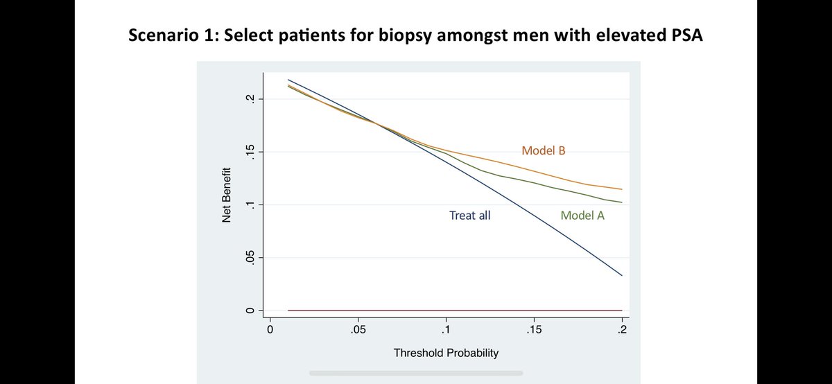
Then, @VickersBiostats shared this decision curve with me for Scenario 1. Indeed, Model B has ⬆️ net benefit vs. Model A in the range of thresholds between 5-20%. Model B is also better than biopsying everyone or no one. How do we interpret this curve? Let’s walk through it.
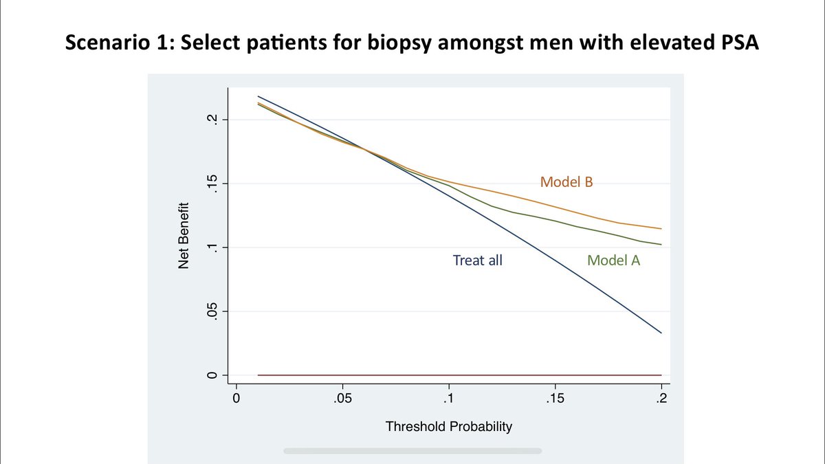
First, let’s ask ourselves what is the maximum benefit a model could do if it could perfectly separate cases. By sending only those patients to get biopsy who needed one (and no one who didn’t need one), it could benefit 25% of the population (outcome incidence), which is max NB.
So far, so good. Now let’s look at the “treat all” strategy. If there is no harm or cost to biopsying patients, then we should just biopsy everyone to maximize net benefit. But what if there’s a cost or harm associated with a biopsy? Should we still treat everyone?
As the cost/benefit ratio changes, the strategy to treat everyone pays off less and less as more harm is done in intervening on people w/I the outcome. Focusing only on the x-axis for a moment, I really like how the rmda R package (right) makes the cost/benefit ratio explicit.

A rationally chosen risk threshold (shown as t in this equation) is a function of this cost/benefit ratio. In cases where actual utilities are not known, I find this equation slightly complicated to explain to clinicians. I propose we should normalize use of a simpler one: NWE.
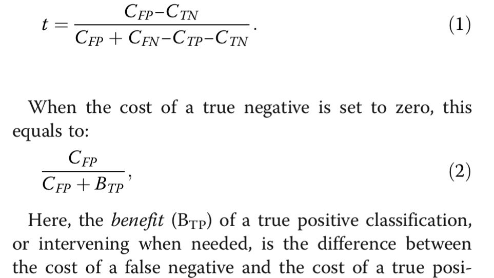
If the cost of a FP is 1 and benefit of a TP is 4, then C/B ratio is 1:4. However, this translates to a risk threshold of 20% (and NOT 25%). However, if ask a clinician how many pts would you be willing to evaluate (NWE) to capture one TP, they would say 5. 1/NWE = 1/5 = 20%
So when we look back at this decision curve, the thresholds on x-axis can be thought of as 1/NWE. At a biopsy threshold of 5%, clinicians are willing to evaluate 20 pts to find one case. It’s just way to express the cost/benefit ratio.

As clinicians are willing to eval fewer and fewer patients, the strategy to treat everyone confers less and less benefit. When clinicians are only willing to eval 4 pts to find 1 case (threshold of 0.25), there is no NB. At this threshold, treat all has same NB as treat none.

So one key lesson on interpreting decision curves is this: Both the y-intercept (net benefit) and the x-intercept (threshold probability) for the treat-all strategy is equal to the proportion of patients that experience the outcome in the evaluation data.


Is the treat-all strategy a line? It looks linear but is actually a curve. Why? Let’s derive equation for net benefit. First, the benefit from treating true positives is the prevalence of TPs times the sensitivity (true pos rate) of your model.
In treat-all approach, sensitivity is 100%, so the benefit from treating everyone is simply equal to the prevalence (no matter what!) The cost of treating false positives, on the other hand, depends on proportion of negatives, the false positive rate, and the cost/benefit ratio.
In treat-all approach, proportion of negatives is 1-prevalence (of outcome), false pos rate is 100% (bc this is 1-spec and spec=0% when sens=100%), and cost/benefit ratio is a function of threshold. When solving below equation for threshold (R): C/B = R/(1-R)

So the final equation for NB is: (P x TPR) - (1-P) x FPR x (R/(1-R)) For treat-all strategy, this becomes: P - (1-P) x (R/(1-R)) Assuming P of 0.25 (as in our data), Wolfram Alpha gives us this plot:
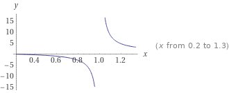
Now that might look totally wacky but that’s only Bc the axis range is all wrong. Zoom into the area of interest (threshold 0 to 0.25), and you’ll see it’s exactly what was produced by the decision curve. Only purpose of showing zoomed out plot was to show why not linear.


The only thing that changes for Models A and B is the true positive rate and false positive rate. In Scenario #1, if you are willing to accept a threshold of 0.05 to 0.20 (translation: willing to eval 5 [1/0.20] to 20 [1.0.05] pts to find 1 case), then Model B is the best.

Conclusion: Let’s think back to when we first saw that Model A had higher AUC and both models were miscalibrated. Neither seemed quite perfect. What the decision curve does is take this implicitly uncomfortable uncertainty and help us quantify whether the model is “good enough.”
In medicine, we take the Hippocratic Oath and promise to do no harm. When applying ML and AI models in healthcare, decision curves can help us decide if a model will do less harm than a treat-all or treat-none (“do no harm”) strategy under an *assumed* cost/benefit ratio. /Fin
@kdpsinghlab Can’t make decisions on the basis of ROC AUC as 1) it is not proper scoring rule 2) doesn’t encourage good probabilities produced by the models. In fact no medial applications ever should be allows on the basis of ROC AUC itself as it ignores calibration.
@kdpsinghlab This is a great thread. Very interesting. Decision curves have been buried in my stack of things to read about for a while, but you’ve inspired me to move them to the top!
@MarkZobeck Thanks Mark! As @VickersBiostats knows, I’ve been in sitting in the same position as you for a while. Feel free to check out http://decisioncurveanalysis.o... for a list of papers. Happy to share individual paper recommendations too.
@kdpsinghlab @ADAlthousePhD If there was a "multiple RT button" I would use it compulsively now.
@femadettiriel @ADAlthousePhD Thanks! You can always press QT. 😉
@kdpsinghlab This is a great thread. Thank you so much for sharing!