
1/ We've talked before about how latency is an important component of every crypto HFT strategy. The optimization process is fun detective work because the exchange's tech is often a black box. A thread on what to measure, graph, and analyze for your production HFT system 🧵

2/ The first important number to look at is the "exchange timestamp" field of websocket messages and REST responses. If multiple time fields exist, use the one corresponding to matching engine time. The other fields are edge server times, which add more noise to your analysis
3/ Matching engine time is crucial because network delay and the exchange's internal machine topology add noise to the outgoing timestamps on your end. Reconcile the matching engine and your outgoing timestamps and you can quantify and optimize the factors in between
4/ The first thing to do is plot the difference between your clock and the matching engine clock at the time of receipt of each message. For example, here is that time delta plot for feed messages on one exchange across a few hours.
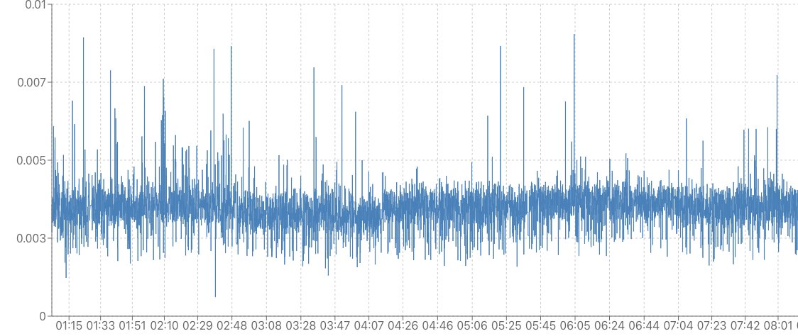
5/ If it's your first time seeing it, this graph is already useful. You can overlay the graph for different endpoints and pick the fastest one. You can make a similar graph for order responses and cancel responses. However, these graphs are most interesting when they spike.
6/ When round trip order latency spikes, there are two common causes: 1) the exchange is overloaded or 2) your strategy is having trouble keeping up with incoming data In this case it's helpful to overlay # messages per second that your strategy is processing (in red below)
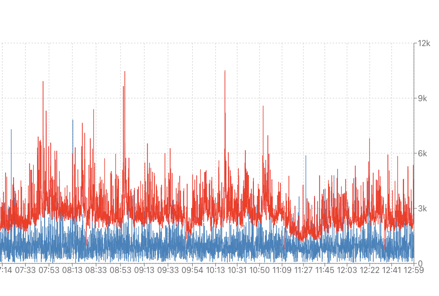
7/ The graph above looks healthy: we discarded the outliers and things looks smooth. If the blue line increases 1) accumulate for a bit instead of reverting and 2) line up with the red line spikes then you know you're too slow. Simplify or parallelize your strategy logic
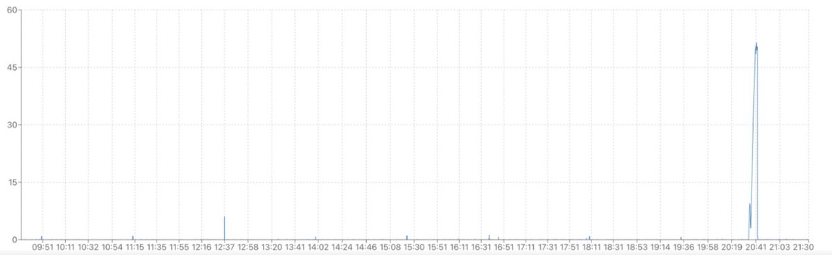
8/ An extreme example when we first looked at these graphs: When things went crazy messages came in at >10x the rate during high volatility. Yes those are *seconds* on the y-axis. Action item for us was simple, get a lot more boxes and split up the symbols.
9/ This is just scratching the surface on the analysis you can do with these latency measurements. Hope it's helpful for those starting out. Let me know what to cover in a followup, e.g. more accurate simulations, live adjustments on the strategy side, etc.
@chameleon_jeff This is a really good thread, bravo @chameleon_jeff
@TimMeggs Thanks, glad it was helpful
@chameleon_jeff I know Stanford company helping people do this for a living now https://www.clockwork.io/
@chameleon_jeff @threadreaderapp unroll #HFT