
This tie and pocket square combination is very bad. Let's talk about how to choose better ones. 🧵
Why is this bad? Two reasons: — Tie and square should never look like they came in a matching set. This looks contrived. — Except for white, solid silks are almost always bad. They make you look like a magician. Or in this case, like you've nicked a pair of women's underwear

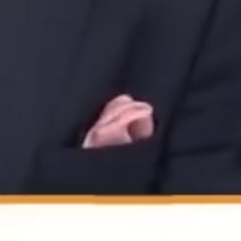
Instead, it should look like you've plucked something from a dresser drawer and thrown it into your pocket (but not your wife's underwear drawer). It should look pleasing, but not overly coordinated. This gives the impression of effortlessness, even if you've put in effort.
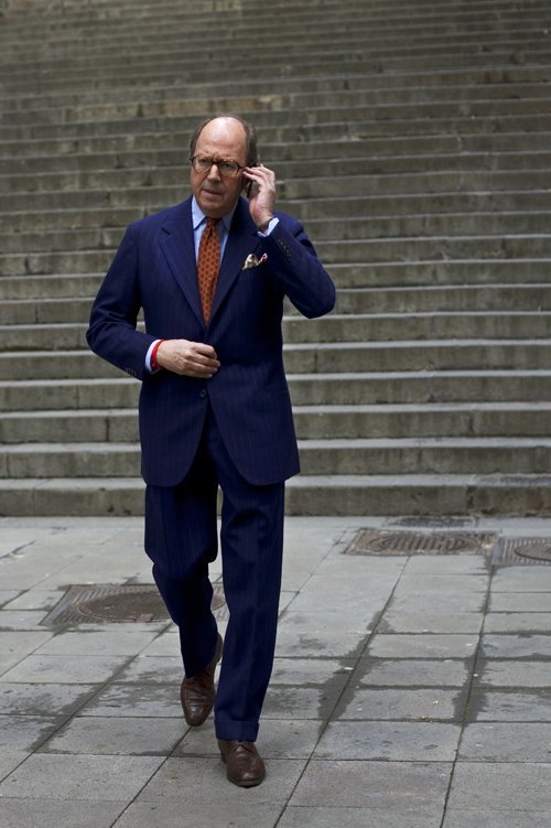

How does one do this? There are a few ways. The first is to choose a square with a background color that echos a secondary color in your tie. Here, the patterned burgundy square picks up the burgundy squares on the tie. Coordinates, but doesn't exactly match.
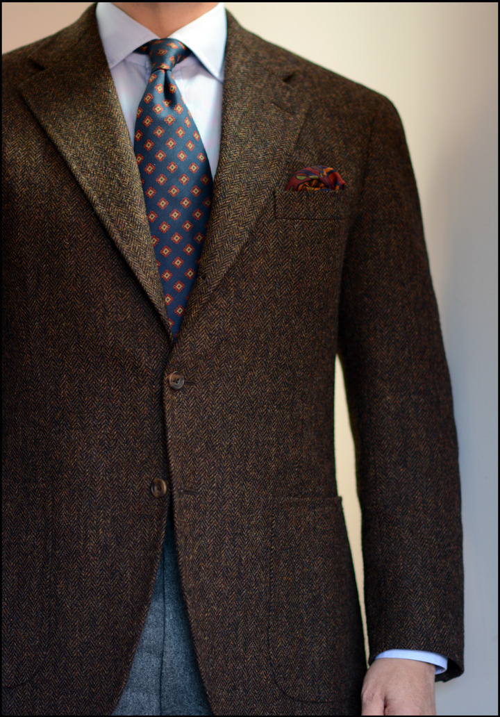
Another way is to choose a square with a main color that complements your tie. Easy way to think of this is the color wheel—colors directly opposite or adjacent typically complement. Here's a brown tie with a green pocket square.
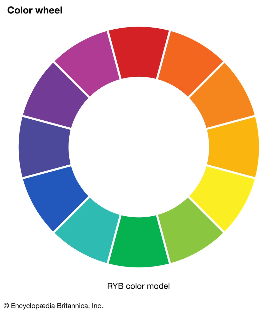
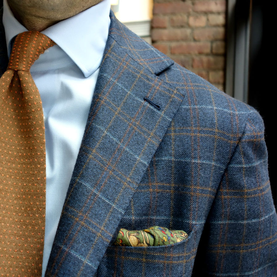
The point is to look put together, but not overly coordinated. This gives the impression of naturalness and effortlessness, even if you happened to have put a lot of thought into this.
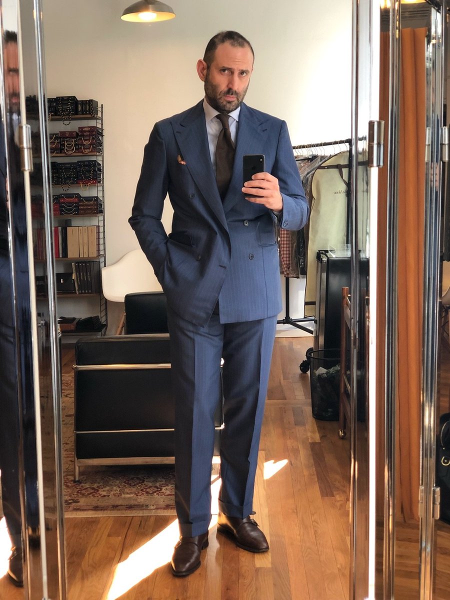

When in doubt, you will never go wrong with a solid white linen pocket square. Get one with hand rolled edges so it doesn't look like you've stuffed napkin in your pocket.


Most people don't wear ties nowadays. If you don't, then the choice is even easier: choose a patterned square that simply looks good in your pocket.
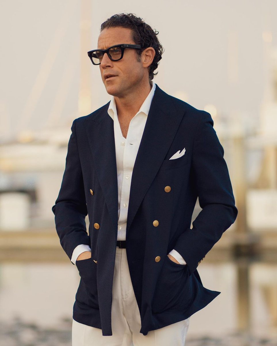
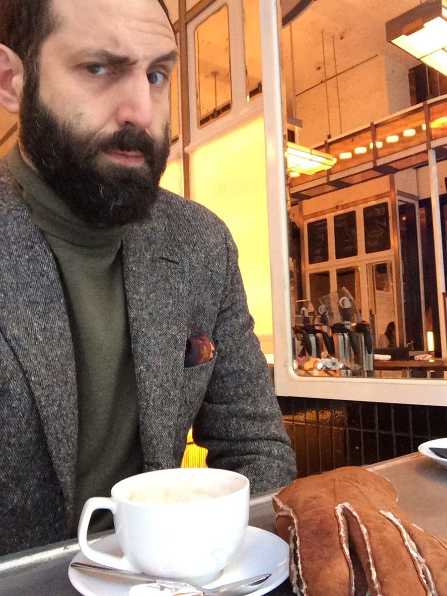
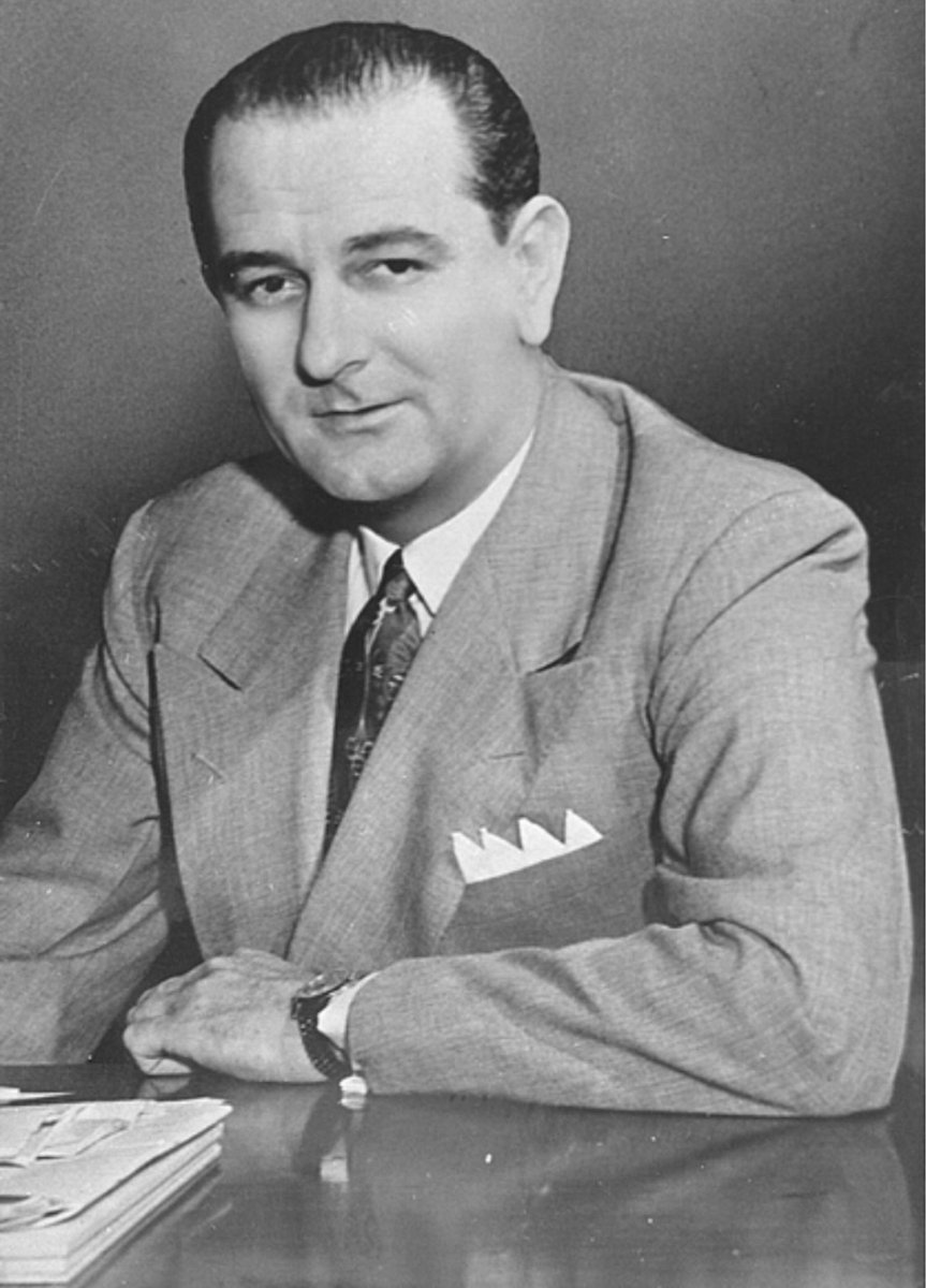
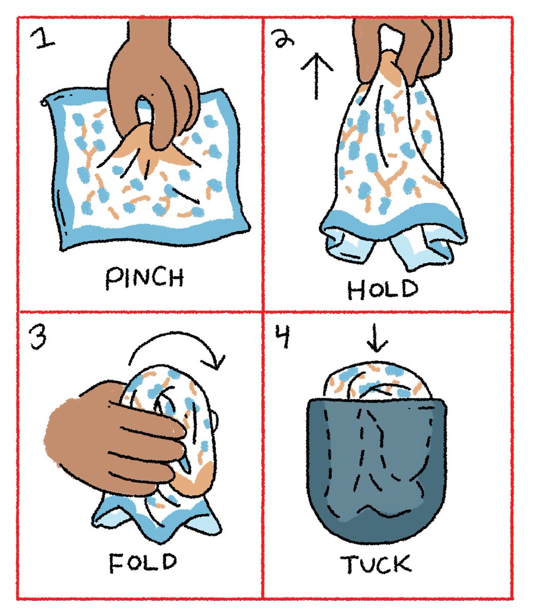
Finally, always stuff your square into your pocket, don't do one of these origami folds like Pres. Johnson. The exception is white linen squares neatly folded into what's sometimes called a TV fold (you can look it up). illustration by IG ryancecil
@dieworkwear Do you have any advice on how to best wear an ear bandage?
@dieworkwear How about the cult bandage? To a former healthcare expert, it looks badly done.
@dieworkwear He has made a lot of poor aesthetic choices here
@dieworkwear Great thread 👍
@dieworkwear Has the white color on colored shirt always been acceptable or is it a dated look?
@dieworkwear Usually like your threads but what a big load of Yankee rubbish.
@dieworkwear Kinda hard to focus on the tie and pocket square in this video 🤣🤣🤣
@dieworkwear I like a matching tie and square now and then tbh. and pink on baby blue looks good
@dieworkwear Thank you as bad as the cult bandage
@dieworkwear Having flashbacks to 1992
@dieworkwear Personally I think we need to start designing a range of ear bandages because this one CLASHY af
@dieworkwear Your content is great!!! 🙌🏼
@dieworkwear Because it's matching / too much like it's from a set? I personally wouldn't go for a perfectly matching combo.
@dieworkwear The “bandage” looks like people are literally going insane and they should go into a true asylum for the mentally unstable
@dieworkwear Yep, but his ear pillow isn't by Mr. Lindell!
@dieworkwear Thank you! Good to know
@dieworkwear Would your opinion be the same if his ear pillow matched?
@dieworkwear Let's talk about you having ruined every suit I see these days !
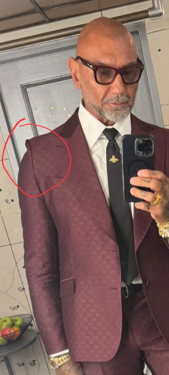
@dieworkwear The pocket square is not nearly as big of a problem as this:

@dieworkwear And then one must consider how to coordinate the bandage.
@dieworkwear couldve been fixed by shoving the bandage in the pocket, eeasy

@dieworkwear And a white collar with a blue shirt. What century is he living in?
@dieworkwear But shouldn’t the Kotex pad on the ear be color-coordinated with the tie & pocket square?
@dieworkwear And as disappointing, the decision to not source a sanitary pad for his ear in the colour palette for his tie and pocket square. Perhaps related, does one need a pocket square if one is wearing a farshion item on one's ear. So many questions, so little time. As you were...
@dieworkwear That whole look is heinous, WOOF.
@dieworkwear Let’s see some lib style criticism Mr Menswear.