
Introducing “OutperformX VCPSwing" Indicator! 📈 Designed to measure and visualize the relative strength and outperformance of a stock compared to a benchmark. Indicator Link : [https://www.tradingview.com/sc... Thanks to @eeeshanc9 for the valuable inputs and developing this

Alpha Calculation: What's it About? The key component of this indicator is the Alpha calculation, which measures a stock's outperformance relative to a base index (e.g., Nifty Midsmall 400) while accounting for risk-free returns. By comparing the stock's performance with the

Customizable Inputs You can choose whether to display Alpha. Change the Base Index (e.g., NiftyMidsmall400). Adjust the Performance Period (Days) for custom Alpha/Outperformance calculations. Performance options range from 5 to 252 days, helping to fine-tune the outperformance

Highlighting Performance Peaks: Short-Term & Long-Term The indicator automatically highlights Short-Term Peak Performance over customizable short-term windows (e.g., 21 days). It also detects Long-Term Performance Peaks, spanning up to 52 weeks. These peaks are represented as
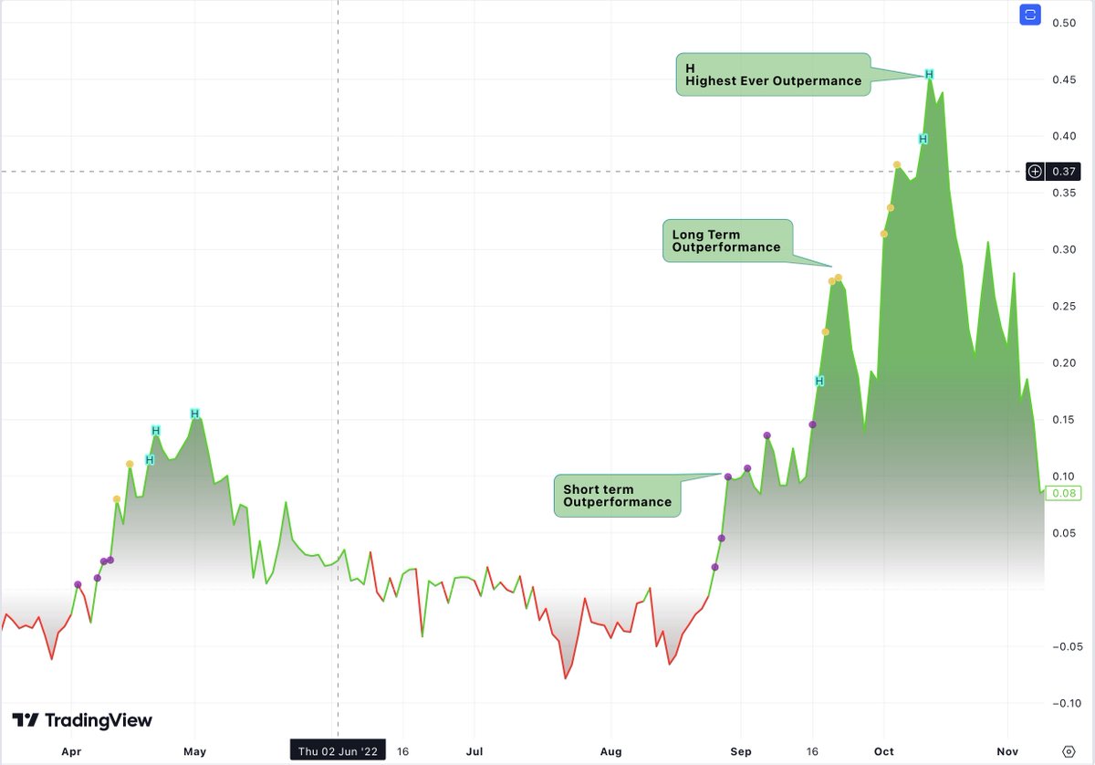
Color-Coded Alpha To make the indicator visually intuitive: Positive Alpha (outperformance) is marked in green. Negative Alpha (underperformance) is shown in red. These are customizable so you can adjust colors to your preference!

Outperformance Before Price Peaks One cool feature is tracking whether Alpha outperforms before the price hits new highs. If Alpha breaks out but price lags, a “dot” is drawn, giving a heads-up on potential upcoming price moves.

Filling the Alpha Zone The indicator fills the area between the Alpha line and zero. This shading helps highlight the magnitude of outperformance (or underperformance) and provides a quick visual cue about trends.
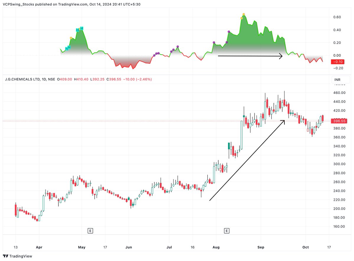
Few Studies :


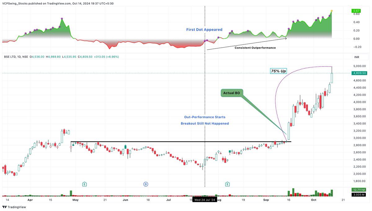
If you find this valuable, like and retweet the first tweet👇 https://x.com/VCPSwing/status/...
@VCPSwing @eeeshanc9 Great My Next Video on this !
@JayneshKasliwal @eeeshanc9 Thank you Jaynesh bhai 🤝
@VCPSwing @eeeshanc9 Amazing tool bhai. Tried it on 100+ charts. Very helpful. Another marvellous addition to Free indicators 👏🙌 I recommend everyone to try it out
@VCPSwing @eeeshanc9 Amazing tool sir tried it in morning in many stock 👌👌👌.. result was superb
@VCPSwing @eeeshanc9 Thank you...This is a great help for all small traders. Thank you for everything
@VCPSwing @eeeshanc9 Just 1 suggestion color the candle where the 1st dot 2nd dot etc appear etc so people can track that chart or keep in watchlist and don't have to check the graph again etc
@dhawal20jain @eeeshanc9 Need to check, if it's possible.
@VCPSwing @eeeshanc9 Guys you have done amazing work, Had I known this tool earlier , It would have resulted amazing, I was just back testing on APAR stock and I got multiple times entry and exit & resulting in 15% to 40% + upmove with 15-20days of time frame. Refer some snaps .


@vivekspatil19 @eeeshanc9 Please Don;t See it as Buy/Sell . This is to See how your stocks doing with Markets !
@VCPSwing @eeeshanc9 Peak stuff for free🔝🤩
@VCPSwing @eeeshanc9 Excellent stuff, sir. Thank you for sharing such amazing tools with us. 🙏
@VCPSwing @eeeshanc9 lovely brother
@pradytrader1 @eeeshanc9 Thanks prady
@VCPSwing @eeeshanc9 Thanks for sharing buddy
@VCPSwing @eeeshanc9 Thank you for such a beautiful work for the community!
@VCPSwing @eeeshanc9 Thank you sir
@VCPSwing @eeeshanc9 Thank you bhai🙏🏻🙇🏻♂️❤️
@VCPSwing @eeeshanc9 Great work bro...👍🏻
@VCPSwing @eeeshanc9 Thanks bro good information
@VCPSwing @eeeshanc9 Thank you 🙏
@VCPSwing @eeeshanc9 Good one
@VCPSwing @eeeshanc9 sir, small mistake, here "highest short term performance"

@digital_dalal45 @eeeshanc9 Will Do it in Update
@VCPSwing @eeeshanc9 Gradient color choice is amazing! 👌
@EquityCraze @eeeshanc9 Thanks Ganesh
@VCPSwing @eeeshanc9 Excellent work - much beneficial Thanks a ton
@VCPSwing @eeeshanc9 Thank you Sir.
@VCPSwing @eeeshanc9 What does the dots indicate, in different colours