
footprint charts (a complete guide) a thread 🧵

footprint vs regular charts: footprint charts are a cleaner visual of the time & sales data. it places buy/sell info on a per cluster basis, inside the candle. doing this allows for easier identification of high volume/delta zones, absorption & trapped traders.

tick sizes: inside the footprint, the cluster is divided into price blocks. Changing the tick size changes the granularity of these price blocks within each cluster. larger tick size for increased volatility, lower the tick size when less volatile.

absorption: reminder that for every market sell (footprint) there must be an opposing side passive limit buyer absorbing that sell. market sell = limit buy market buy = limit sell extreme delta within the same zone is an indication of big player absorption from the limit side.
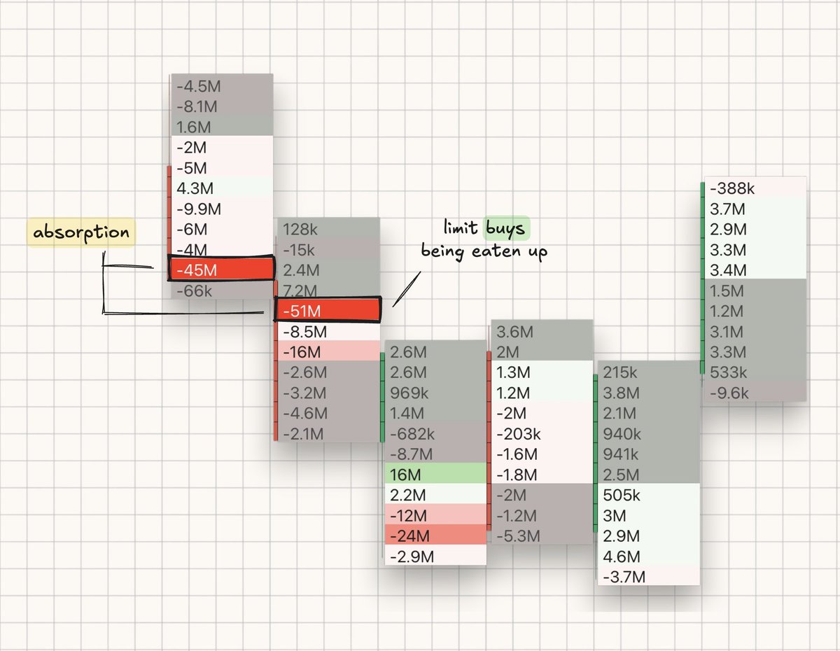
trapped traders: 1. identify aggressive sellers into your key level 2. find the point in which those sellers are offside 3. enter upon closes above forcing point large amounts of delta is not only a sign of trapped positions but large limit orders being filled. example ↓

cluster/profile types: I use the delta-cluster which shades each price cluster based on delta. upon sweeps of highs/lows look for aggressive shading in clusters to identify trapped positions entering and opposing side orders being filled. below is a list of all cluster

hope you found this valuable, any further questions don't hesitate to ask below. I plan on posting more in-depth footprint/flow resources in the coming weeks, if you want any specific topic covered be sure to let me know.