
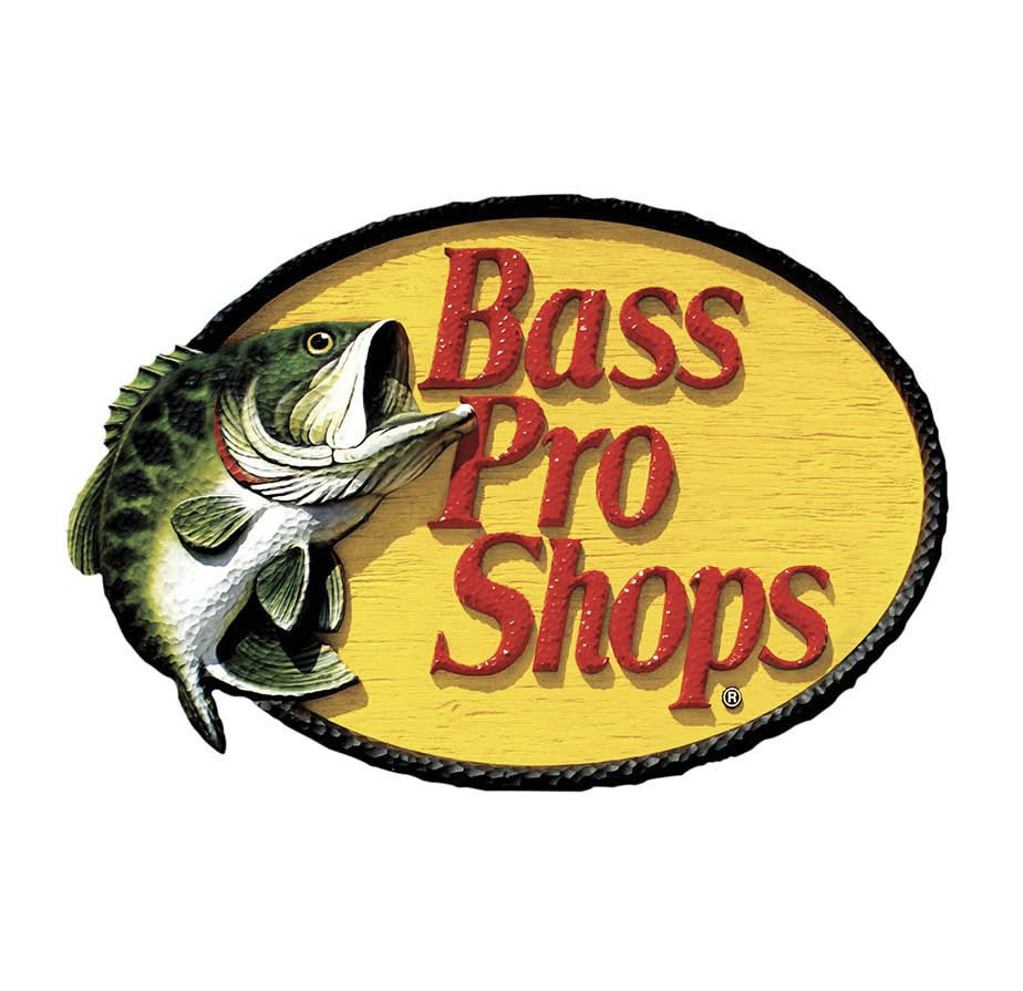
Bass pro shops has updated their logo for the first time in 53 years.

jokes jokes 🤭
@YIMBYLAND What the fuck
@mattparlmer ITS A JOKE
@YIMBYLAND don’t play with my heart like this YL
@_denoiser_ heh
@YIMBYLAND got my ass good almost cc'd lindyman on this
@zhougsoft you should cc him anyways
@YIMBYLAND Evil shit post. Blocked and reported 😭
@YIMBYLAND All time poaster
@YIMBYLAND Noooooo
@ADoricko JOKES
@YIMBYLAND 😂 Great critique of the modern corpo-design language so ubiquitous in today's branding. Literally, everything new today is just a lesser version of something in the past! Sad. Civilization is on the decline!
@YIMBYLAND The highly detailed bass logo was reminiscent of Hitler's intricate paintings early in his personal life, which preceeded his rise to power. Bass Pro Shops spent 8 million dollars over 13 months developing a more refined, contemporary logo that more accurately reflected their
@YIMBYLAND ain’t no way in hell. if this real, they just took all the life and character out of the logo
@YIMBYLAND No way another one bites the dust
@YIMBYLAND If bass pro actually did that I think people would legitimately protest like it’s the 1960s all over again.
@YIMBYLAND Why even keep the fish? It says it in the name.
@YIMBYLAND Too complicated. I fixed it for you. That'll be $15M please.

@YIMBYLAND Why is everything going so minimalist We are losing all our artistic character in all aspects
@YIMBYLAND STOP. IT. Don’t you see that we can’t tell what’s a fib and what’s real bc what’s real is a fucking joke!!!
@YIMBYLAND And all trucker hats are being replaced by half-rolled yellow beanies
@YIMBYLAND It looks like shit.
@YIMBYLAND Yeah, it’s even better on video!
@YIMBYLAND As if they would even keep the fish
@YIMBYLAND Stop it we're in enough pain today 😞
@YIMBYLAND Everyone is moving to these flat logos.
@YIMBYLAND A lot of these old logos are virtually impossible to do anything with. Especially in the digital world where you lose a lot of detail. Generally speaking, people hate the new logos but don’t have to work with them
@YIMBYLAND It’s giving kodak without the fish

@YIMBYLAND "Still seems to be a bit too busy. Get rid of the fish" - Marketing
@YIMBYLAND No. Stop please. Don't give them ideas.
@YIMBYLAND It's a joke. Right? Please tell me it's a joke
@YIMBYLAND Looks like Temu Bass Pro Shops knock off.
@YIMBYLAND the end is near
@YIMBYLAND At least they still have a fish on it😂