
2025-26 NHL Home Uniform Survey RESULTS 903 of you rated each uniform out of 10; here are the results. #32: Washington Capitals - 3.7/10 For the second year in a row, the Caps' Rbk Edge leftovers finish 32nd.

#31: Carolina Hurricanes - 4.0/10 Despite nods to hurricane flags and a state outline hidden in the logo, the black Canes jerseys lack contrast and just look awkward. The mismatch with their other two uniforms doesn't help.

#30: Nashville Predators - 4.2/10 The consensus on the Preds' look: too plain and way too yellow.

#29: Columbus Blue Jackets - 4.6/10 After 18 years in these pretty plain and non-descript uniforms, maybe it's time for the Jackets to shake things up a bit.

#28: Vegas Golden Knights - 4.7/10 They might look less ugly in person, but sparkly-mustard and grey is an eyesore on camera.

#27: Tampa Bay Lightning - 4.7/10 No amount of on-ice success has endeared hockey fans to the Lightning's plain pseudo-vintage look in the past 14 seasons.

#26: Dallas Stars - 4.8/10 The Stars' green jerseys shoot for timeless but the unpopular logo and original six-inspired design have never been a big hit.

#25: Florida Panthers - 5.2/10 The more fans see the Panthers' military-inspired uniforms the less they like them; this is their lowest finish since these surveys began in 2022.

#24: Winnipeg Jets - 5.6/10 The Jet 2.0 uniforms have a very 2010s look and have many fans clamouring for a return of the vintage sweaters.

#23: New York Islanders - 5.6/10 The Isles' inaugural season look has served them pretty well, but are they overdue for a return to the dynasty-era jerseys?

#22: New Jersey Devils - 5.6/10 The Devils' brand is solid enough, but it's still not clear why they downgraded from their classic Cup-winning pre-Adidas design.

#21: Philadelphia Flyers - 5.8/10 The Flyers' kinda-redesign two years ago made no impact on their ranking, but the darker orange is pretty nice.

#20: Anaheim Ducks - 5.8/10 The Ducks' big redesign got them ranked #9 in last year's poll. Unfortunately, seeing them in action took the shine off. They're not last-place like the old ones, but they drop 11 spots.

#19: Vancouver Canucks - 5.8/10 The Canucks have stuck with the blue and green orca look for 18 seasons, but will the pull of 90s nostalgia encourage them to promote the f̶l̶y̶i̶n̶g̶ ̶s̶p̶a̶g̶h̶e̶t̶t̶i̶ skate jerseys?

#18: Ottawa Senators - 6/10 The shine has worn off the Sens' inaugural look since they were reintroduced in 2021, but they hold their spot in the middle tier here.

#17: Utah Mammoth - 6/10 The Mammoth logo has gone over pretty well but sticking with the generic placeholder uniforms was a missed opportunity. Nonetheless, adding a proper logo helps them jump from #31 on last year's list to #17.

#16: Minnesota Wild - 6.1/10 You'll never guess which team ended up in right the middle of this ranking.

#15: Colorado Avalanche - 6.5/10 The Avs remain at 15 with a look that effectively updates their 1990s uniforms.

#14: Seattle Kraken - 6.5/10 The Kraken uniform finished 5th in its first two seasons, then 10th last season, and now 14th. The novelty seems to have worn off, and apparently their slide into mediocrity isn't confined to on-ice play.

#13: Los Angeles Kings - 6.7/10 There are nits to be picked with the Kings' updated throwbacks (that waist stripe is a bit thick, eh?) but it's a solid upgrade on their 2010s look.

#12: Toronto Maple Leafs - 6.7/10 The Leafs' uniforms are clean and classic, although fans ranked them last among the Original 6.

#11: New York Rangers - 6.8/10 The Rangers actually dropped from 6th to 11th this year, but these uniforms always look crisp and vibrant on the ice.

#10: San Jose Sharks - 6.8/10 The Sharks sneak into the top 10 for the first time, as voters clearly don't think there's such thing as too much teal.

#9: St. Louis Blues - 6.9/10 Ditching the Cup uniforms for a lighter and more vintage look served the Blues well in this poll, leaping from 21st to 9th. I still don't get why there are no outlines on the numbers, though

#8: Edmonton Oilers - 7/10 A Stanley Cup showcase hasn't hurt the Oilers' classic blue-and-orange uniforms, which have been solidly in the top 10 since they were reintroduced.

#7: Pittsburgh Penguins - 7.2/10 The Pens don't look so good on the ice anymore, but don't blame their iconic jerseys.
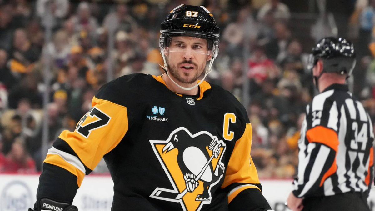
#6: Boston Bruins - 7.3/10 Boston's re-designed look ditches the gold shoulders and swaps out the logo for a 70s-inspired, leaner and meaner look. As usual, it's comfortably top ten.

#5: Chicago Blackhawks - 7.5/10 The Blackhawks move into the top 5 for the first time, receiving the second-most 1st place votes on the list.

#4: Detroit Red Wings - 7.5/10 The Wings' simple and effective red-and-white sweaters have held up for 93 years for a reason.
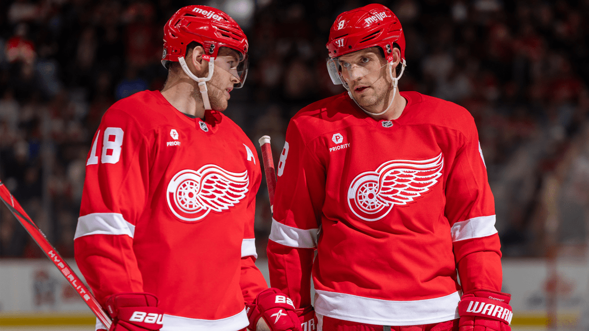
#3: Buffalo Sabres - 7.5/10 Bold colours, a classic logo, and a clean design keep the Sabres in the top three.

@JFreshHockey People don’t like Washington jersey?!! I think it’s one of the nicest When it came out years ago, everyone loved it . What happened?!?!
@Lochness12021 there was a novelty factor but they are pretty of their time. when they were introduced everyone was sick of the eagle and the black+gold and now everyone's nostalgic for it and wants it back. if they change them, in 20 years everyone will want the ovi jerseys back
@JFreshHockey This feels more like a popularity contest than an actual jersey ranking.
@AxnJxnCards no I'm pretty sure it's a jersey ranking