
A short thread on custom retro app icons! (1/4)
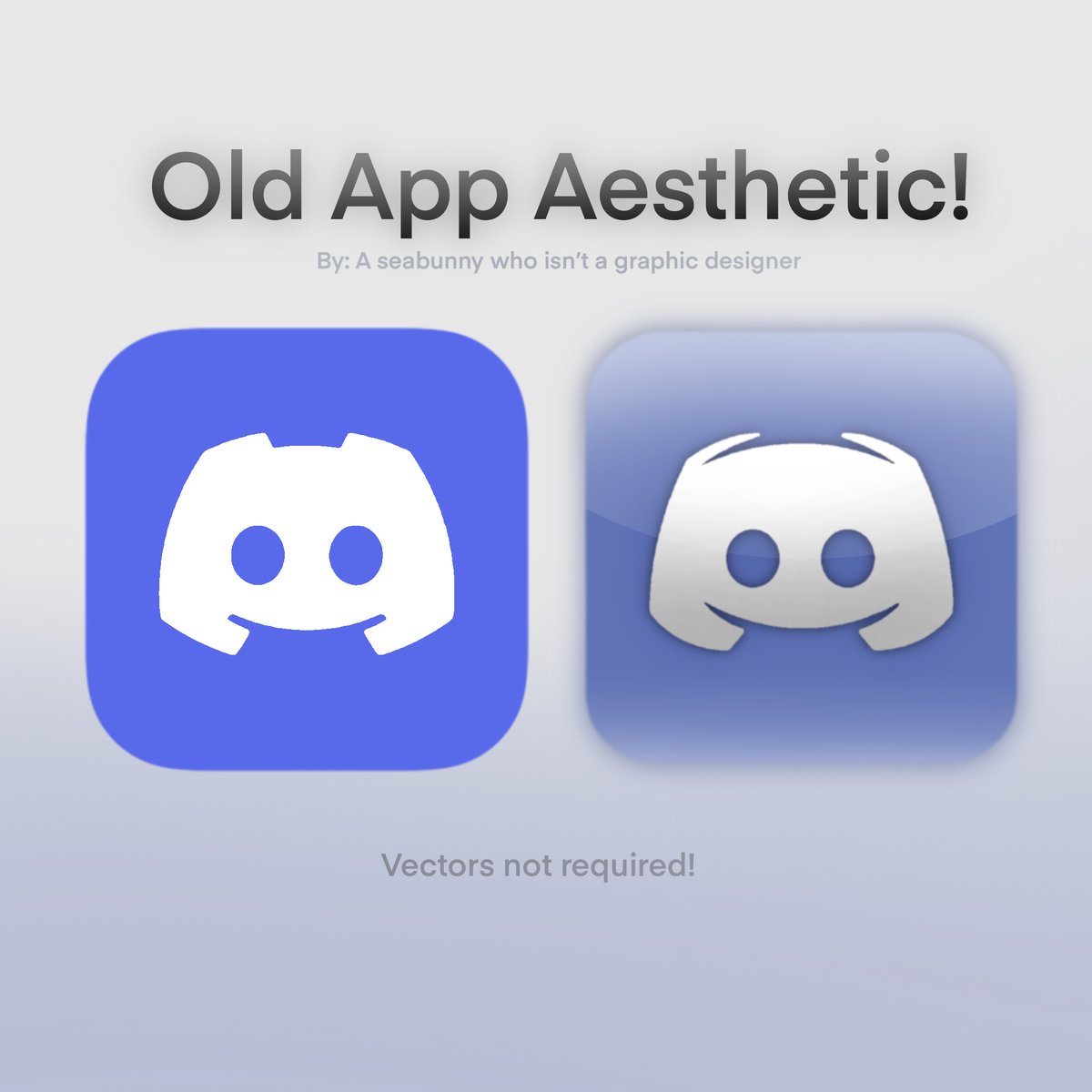
(2/4)


(3/4)


(4/4) Be creative and have fun making custom apps!!
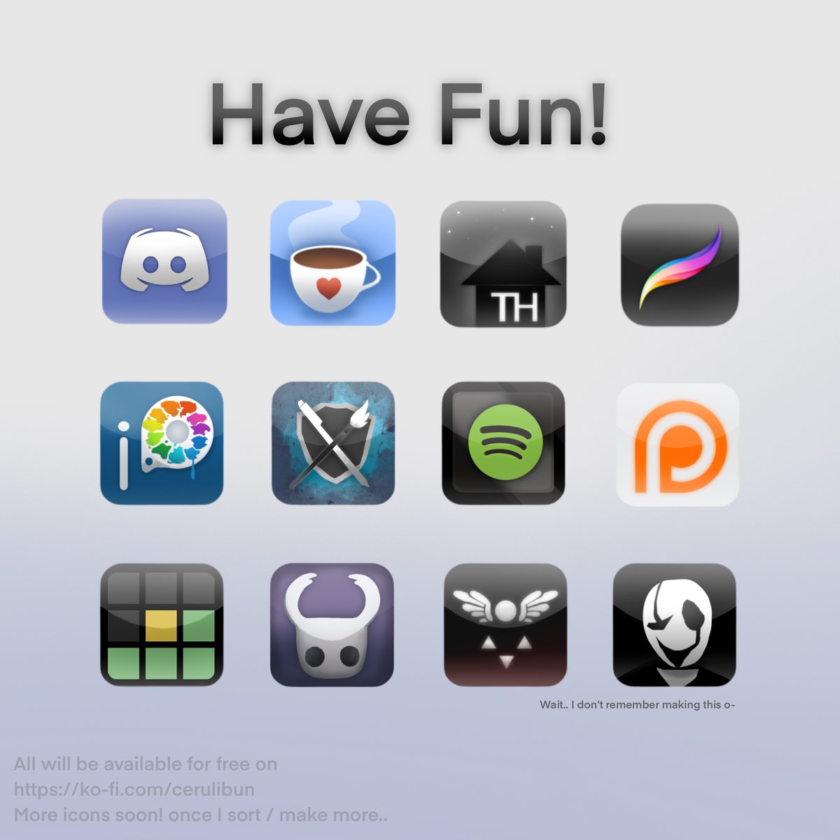
Holy.. I seriously did not expect the level of reach??.. Thank you all! I’d love to make more of these with more info for next time as this was made for fun! Follow for more retroslop I just like it 🫶 https://x.com/CeruliBun/status...
@CeruliBun This style was so fucking good, I can’t stand this oversaturated and simplistic style every company is doing now
@krixas_dragon Thank youu!! And YEAHH they each have their ups and downs but.. the new patreon scares me 💔
@CeruliBun I caught this at like 12 likes, came back 3 hours later and it had like 650, and now it has 45k What the fuck
@Thatreplyperson HELP YOU WERE LIKE THE SECOND I THINK AGDGSHAHHA 😭😭
@CeruliBun I like the Discord one most : compromise between flat+two colors and 3D bright feeling. It's both recognizable and not too much far from the majority of users color expectations.
@CeruliBun Ew
@CeruliBun this is so retro
@CeruliBun this making me wanna redo my home screen
@CeruliBun So Frutiger Aero? Im in.
@CeruliBun Doenst make any difference left or right Haha
@CeruliBun What I based my iPhone layout on

@CeruliBun not old enough get on my level

@CeruliBun (ancient person voice) that's not retro......
@CeruliBun Wdym retro discord is like what 2 years old?
@CeruliBun Still better than the current cooperative soulless icons
@CeruliBun ah, the late 2000s aesthetic. I used to make logo with that style on Coreldraw.
@CeruliBun can you just make every single app icon and post them
@CeruliBun Remember the time when frutiger aero was considered futuristic and not "old"?
@CeruliBun why we stopped making these
@CeruliBun did i do it

@CeruliBun I miss when things were allowed to be pretty man

@CeruliBun u sohuld take a look at the ColorOS 7.2 system logos looks almost like the old logo but wider
@CeruliBun These are gas fire flames
@CeruliBun "retro".. um... no, that's not how Aero worked. And using Discord as an example, instead of adding filters to a flat logo, the logo could literally be a stylized joystick. Hence, skeuomorphism had its purpose: to know what functions an app performed at a glance.

@CeruliBun Flat 2D looks better imo, it just these old icons bring nostalgic feel
@CeruliBun frutiger is retro now?
@CeruliBun Boring Discord vs. Evil Discord
@CeruliBun wait is this your discord icon? i think i ended up using it on my phone somehow lol
