
How to Revise an Academic Poster? Designing a clear poster is an essential skill for students. We recently revised one for a paper presented last week. BUT, instead of just one student benefiting from the process, I’m sharing it and hope some will find it helpful. 🧵
In the initial draft, it's common to simply include most of the figures and tables from the paper on the poster. This is a good start. BUT, this often results in too much detail, making the poster less effective at communicating the main message.

In the 2nd draft, we highlight the key messages (problem, key idea, results). BUT, there are many design/layout/writing choices that we can improve. Let's take a closer look at them! Shall we?

Many posters have these types of school logos. BUT, nobody really knows them, and they are simply too small to be seen. 🔍 A better way is to simply spell out the affiliations instead.

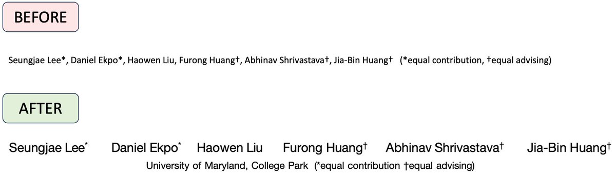
The author list is important. As a junior student, you want to make this part clear and obvious so that other people remember you. Details: - make it large - replace commas with spaces - fix the superscript - use line breaks so that the author list is center-aligned.
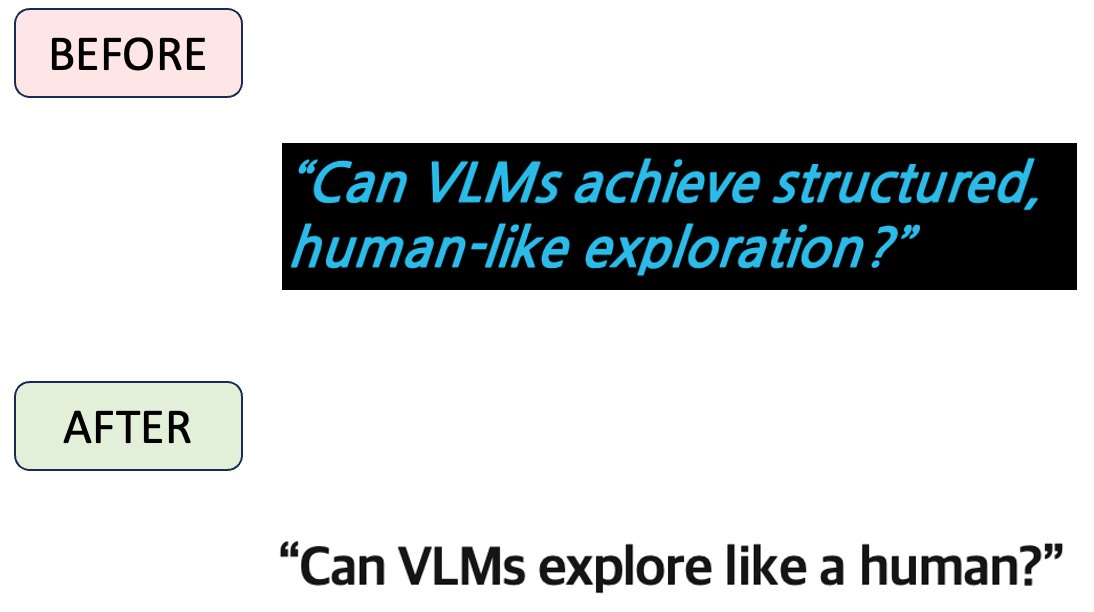
Here, @JayLEE_0301 started with a question. BUT, there are two problems with this question. - 1) unclear what "structured" or "human-like" means - 2) the sentence has TWO lines Always write one-liners! Ain't nobody got time to read!
Bullet points Whenever we use bullet points, we should use parallel writing (or parallel structure). This helps reduce the cognitive load on your readers when parsing the text. (not a fan of many colors, but it's okay as they help establish correspondence with other parts)

Building up correspondence! BEFORE: - unclear relation between title and figure - changing icons AFTER: - tie the three figures with the title - enlarge the text annotation.

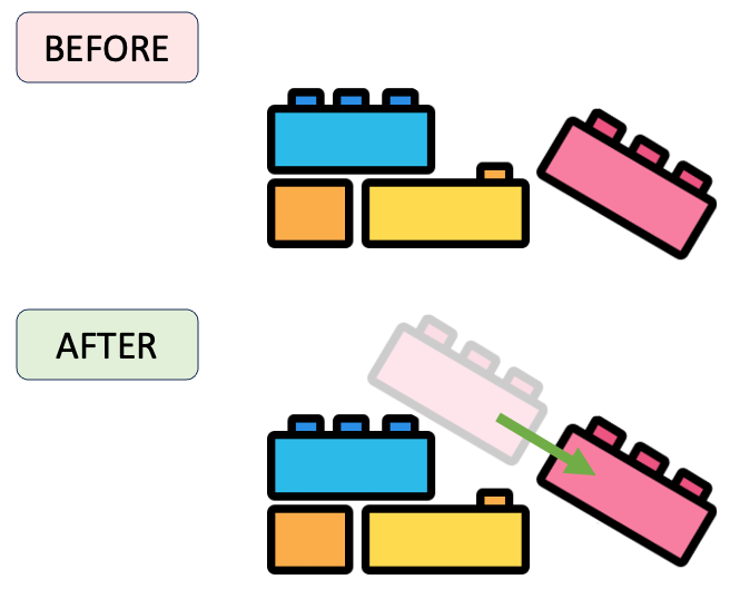
Let's improve the illustration slightly. Here, we aim to convey the concept of possible outcomes (e.g., an unsupported block will slide down). BUT, we only show the final state. Adding "history" and "trajectory" makes the illusion clearer.
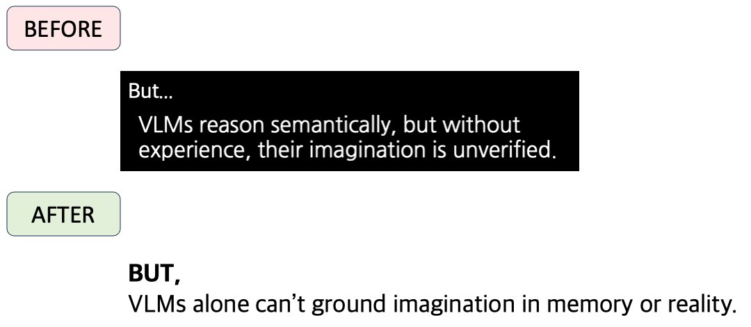
Write concisely and avoid multi-line sentences at all costs!
Now to the middle column. Here, the sentence has parallel structure. That's great! BUT, the layout does not reinforce the parallel concept. Let's align them so we can clearly see the parallel structure.
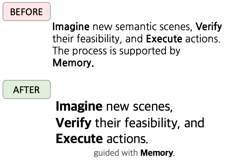
The method overview figure is tricky. It needs to have a proper level of abstraction, yet a sufficient level of detail to illustrate how things work. Here, we adjust the layout and add a few annotations to improve its clarity.

Unless it's a quote, avoid writing complete sentences. Those sentences you intended to write are something you will SAY in a presentation. Let people pay attention to you, not just the poster/slides.

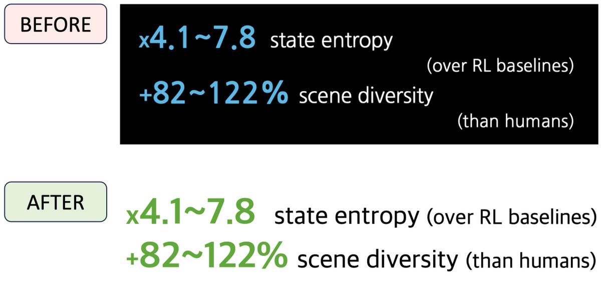
For results, the initial draft is yet another list. I think it would be fun to present it visually for a change. Unfortunately, I was told that robotics people are quite conservative and they will not like this. So my revision suggestion was rejected...

BEFORE Two issues with the original result presentation - unclear correspondence because the texts are not on the same line - the blue color is a bit arbitrary AFTER - fix the alignment - user green to invoke the concept of *gain* (from stock markets)
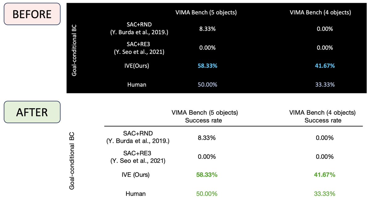
When presenting results in tables, be sure to include annotations (e.g., success rate) to provide context. Without such information, it can be difficult for readers to interpret the results accurately.
Let's put all these together. Here is the revised poster. There are still many areas for improvement, such as the overview figure, excessive text, excessive colors, and layout design. But, with these changes, it's now a decent poster presentation!

Here is the PPT file for the three versions of the poster. https://www.dropbox.com/scl/fi... Thanks, @JayLEE_0301, for the poster design/revision! And if you are interested, check out the research here: https://ive-robot.github.io/
@jbhuang0604 Love this advice on revising posters — very practical and approachable 🙌 In case of interest: we worked on PosterGen (https://y-research-sbu.github.... a tool to auto-generate academic posters. Would be curious to hear your thoughts. : )
@jbhuang0604 Thank you for the tutorial - Another cool alternative is to just have a really powerful thinking model which is also good at UI read the paper and create a website from it. At least for an inspirational draft! :) (e.g. GPT-5-thinking)
@jbhuang0604 The only poster you need 😏 (jk)

@jbhuang0604 Great guide