
Beautiful emails don’t always drive sales Good design means nothing if it doesn’t convert. Here’s how to design emails that actually perform:

1 - Match your website Be congruent with colors, fonts, and layout style. Familiarity builds trust. Emails should feel like a seamless part of your brand. This is an easy win.
2 - Prioritize the Hero section Put the main value or offer at the top. Most people only see the first ~350 pixels before scrolling away. Value/Offer → Call to action should be visible immediately. Here’s a BAD example without a CTA, and a GOOD example.

3 - Use the F-pattern layout People read and scan in an “F” shape. Place key info on the top and left. Guide their eyes where you want them to go.
4 - Balance text and visuals Aim for 60% text, 40% images. Keep visuals clean and easy to consume. Too many visuals will slow your email loading speed.
5 - Optimize your CTA Make buttons big, and pop with contrast. Use clear benefit words: “Build muscle mass today” “Save 15% on your gift” Place the first CTA above the fold. Make it easy to click on any device.
6 - Design for mobile first Use single-column layouts. Body text should be at least 16px. Make buttons big enough to tap easily.
7 - Check dark mode Avoid white-background logos. Use transparent PNG images and compress them. Test your emails in both light and dark settings.
Your design style should heavily match your brand and be heavily friendly to your audience. It’s more about them than about you.
🤝 Work with me and my team: http://ecomadvertisers.com/?tw... 🏆 Get my Klaviyo Email Marketing 2025 Blueprint: https://access.ecomadvertisers...
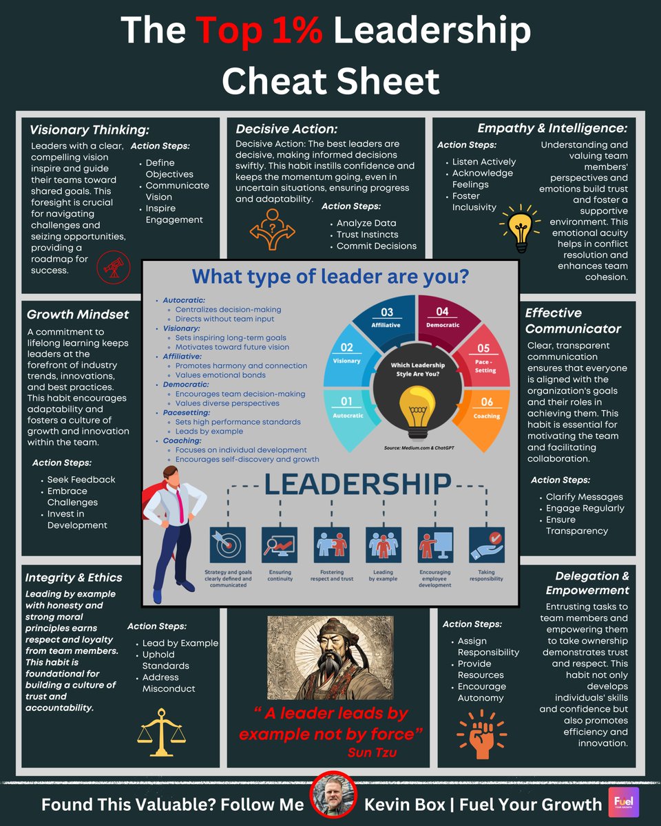
A leader leads by example, not by force." - Sun Tzu Leaders in the top 1% lead differently. Study what they do different below!!
ChatGPT is great, but it doesn’t personally know things So I built my own AI agent that does 🔥 Let me show you how..

May your days be brighter, your stories shine louder, and your world feel a little warmer this Diwali. Happy Diwali from all of us at invideo :)
